How to Graph XYZ Data in 3D Inside Microsoft Excel – Scatter Plots, Surface Graphs and Custom Macros
How to graph XYZ Data in 3D inside Excel
Index:
Intro
Before we get started
– Video reference
XYZ to MESH (Surface Graphs)
– Placing Values
– Custom Macros
– XYZ Mesh
– GitHub XYZMesh
– MatLab
– CelTools
XYZ to 3D Scatter Plots
– Formulas
– XYZ Mesh
– Excel Draw
– CelTools
Conclusion

Intro
 About 8 years ago we published a blog post about how to graph XYZ Data into MESH inside Excel, How to Graph XYZ Data into MESH Inside Microsoft Excel. About two years ago we updated that post with the one called How to graph XYZ data in 3D inside Microsoft Excel. Today we are going to knock both of those post out of the ball park and give you a step-by-step guide on how to make your very own 3D Graphs.
First, please know that Microsoft Excel, while great as a spread sheet application, it does not offer user friendly graphing options for anything more than standard line and bar graphs. This isn’t to say Excel cannot handle complicated graphs, Excel certainly can, but it is not an easy endeavor. However, there are several applications available that make this task extremely simple. Of course, I will be covering these products as well as the most cost-effective method, doing it yourself.

Before we get started!
For those of you who would rather watch this in a video, we have recorded a YouTube video for you. You can either click this link to be taken directly to the video, or you can watch it in our embedded player to the right. The video will cover everything that is in this post, but for the best experience I would recommend that you play the video, listen to it and then follow along in the blog post. Visuals are always great when listening to audio!
How to plot XYZ data in 3D – Surface, WireFrame and MESH

MESH Graph (Surface/Wireframe) Method 1: DIY – Placing Values
Before you can graph a surface graph in Excel you need to know how to format your data. It is true that you need XYZ values, but the raw format of 3 columns is not what Excel needs to plot a surface graph.
This is the section where we teach you how to accomplish the formatting of the XYZ values as well as curving the empty data points yourself. You see, Excel has a nasty habit of assuming that all the data will be present, and if there is an empty data point, then it will make the ‘Not Very Educated Guess’ that the value must be zero. Because of this, we will need to take a few extra steps to ensure that Excel doesn’t flub it up.
First thing you need to realize is that XYZ data is plotted in three columns, X, Y and Z. In order for Excel to plot this into a 3D Surface graph the data must be in a MESH format. A MESH format is a structure that contains rows and columns, much like a spread sheet. X values are set stationary in the first column of every row, Y values are set stationary in the first row of every column and Z values are placed exactly where the X means the Y for the corresponding Z value. To get a better understanding of this, please see the image provided below:

 As the image above illustrates, the X and Y values are easy enough to place, however the Z values will take time. The reason why is because you are going to need to track down and paste every single Z value in the correct place to make this MESH format graph properly. But wait, that was the easy part. Next comes the challenge. You need to calculate the differences between values to get a correct curving of the data. If you skip this part than Excel will assume your empty data points are zero and your graph will look like this (image to the right ->). Which, if you can’t tell, is incorrect.
 There are several different ways to calculate differences between values and distances, but all of them have the same process.
- Pick a calculation method you like; I personally prefer the method of VALUE = A [+/-] ((B – A) / C).
- Place the calculation into an empty cell.
- Drag and drop until you reach the next value.
It might sound simple, but its very time consuming, and if you don’t have your calculations perfect, the graph will be wrong.

Pros:
Completely Free
Cons:
Time Consuming
Not Easy
A lot of manual inputs
MESH Graph (Surface/Wireframe) Method 2: DIY - Macro
This is the real reason I wanted to update the previous blog post. You see, prior to this, there was not really an Excel formatted function for placing XYZ values into a MESH format available for free on the internet. Honestly, it was a pretty simple function that I whipped up in just a couple minutes. Why did I do this, especially when we offer products that do this (and much more) on our main product page? The point of the matter is that I want you to know how to do it in case you need it and can't purchase one of the products listed below.
The code provided above will take the current selection of XYZ values, organize each column and then transpose the sorted X and Y values into a new sheet. It will then search and find each Z values before placing it into the mesh.
How do you run this code? You first need to know how to add a Macro into your Excel document. If you do not know how to do this, don't worry, because I am going to explain it here. However, if you want a more insightful post on how to use Macros and create custom ones, we have an Excel Mastery Course that we offer for free here.
Start by opening up the VBA Editor. You can do that by pressing Alt + F11. On the left hand side of the screen where you see 'VBAProject ([YOUR WORKBOOK NAME]), right click and choose 'Insert'> 'Module'.
Some browsers replace the above code with other fonts, resulting in subtraction signs and quote marks changing into other characters. If you see these errors in your macro, simply replace these characters.
Example:
‘Take good care that J > I
with
‘Take good care that J > I
Example:
xf = rng(rng.Row + r – 1, 1).Value
with
xf = rng(rng.Row + r – 1, 1).Value
Inside that new Module, copy and paste the code above.
Once that is done, go back to your Excel Worksheet and select your XYZ values (not the headers, just the values). Once selected, go back to the VBA Editor, click inside of the name 'ConvertToMeshFormat' at the top of the code and click the green Play button at the top of the editor under the 'Debug' menu option.
Your data should now be organized and displayed on the new sheet!
You may also notice that the empty data cells are still empty. Well, this is where you can use the manual method above to fill in the empty data points, or use a third party took to help out.
Pros:
Free
Cons:
Uses Macros
Needs some experience with programming
Does not utilize curving option
MESH Graph (Surface/Wireframe) Method 3: XYZ Mesh
 There are several methods to convert XYZ into a MESH layout that Excel can read, however there is only one program available that will convert this data into the correct layout and fill in empty data points. This method of filling in missing data is called curving. Curving is a very complex strand of calculations that average the variables over distances and creates an average curve in values depending on the distance. Basically, it makes a calculated guess as to what the numbers should be in that missing data point.
 As we previously mentioned, missing data points in Excel is a big issue. Microsoft Excel looks at these empty data points as data and not missing values. This means that instead of simply skipping these values (like most graphing engines would do), Excel reads them as zeros '0', and in return inputs false data into the graphed picture.
XYZ Mesh is currently the only software available that will take XYZ data and convert it directly into Excel’s MESH format with extremely accurate data curving. Why is this better than the code above? Well, simply put, I made the code above in less than 5 minutes. XYZ Mesh takes that code and ramps it up to by 10,000. No joke. I have been tweaking XYZ Mesh's curving calculations for the past ten years (at the current writing 4/23/2023). The macro above just looks left and right, which XYZ Mesh looks in 8 directions, then 14, and so on. It has developed into quite a complicated algorithm over the many iterations in its lifetime.
So, how does XYZ Mesh work? It's super easy. Just paste your XYZ data into the XYZ input tab on the left of XYZ Mesh and click 'Convert XYZ to Excel Mesh'.
Of course, there are many customization options inside of XYZ Mesh; color variation, decimal replacements, user preferences, etc. But, for 99% of users, the default settings are perfect! Simply paste your values into the corresponding X, Y and Z columns, select your settings and click convert.
In no time the data is converted and displayed in the preview window, displaying a wireframe mesh, surface graph, heat chart, or many other graphing options. From here the data can be exported into Excel. Fast and easy conversions with curving and none of the hassle.
Pros:
Easy to use (basic features)
Simple user interface
Copy-and-Paste functionality
Fast Conversions
No Coding, Programming or Formulas
Cons:
Full version is paid for
MESH Graph (Surface/Wireframe) Method 4: GitHub XYZMesh
XYZMesh (the GitHub ‘program’) was cleverly named ‘XYZMesh’ a few years after we published ‘XYZ Mesh’. Sadly, because they are technically different names, (and because it is not a licensed, paid for or company distributed product) not much can be done about the similarity of the product names. Simply put, the similarity ends there.
XYZMesh (the project posted on GitHub) is not an actual program. Well, it is, but it is not in a format that you might be familiar with. The program itself is nothing more than a search and find. It is also not in a format that is usable by Excel. If you were to download it, the application would be unusable in its current state. That is, unless you know how to read the program language and could convert it to an Excel VBA, at which point, it would be faster for you to write your own search and find subroutine without transcribing one from another language.
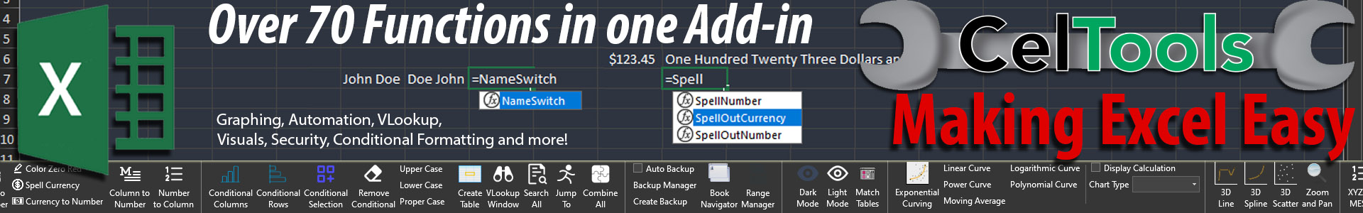
Pros: Cons: Pros: Cons: CelTools is not really a graphing add-in, but it does have some minimal graphing functionalities. The plus side of CelTools is that it comes with so many other tools that can be used for things beside graphing. All of that is outlined on the main page, as well as over several of our blog post. Now the downside to this method is that its not exactly 100% accurate. You see, the code CelTools uses works pretty good with Meshes that do not have many empty points, but its not really that 'smart' of a curving calculation. Like I said, it's not perfect, but if you are in a pinch, it'll work. CelTools is an Excel add-in that truly adds value to any Excel user's workflow. It has over 70 useful functions and features that are not in Excel normally. But, that is the topic of another post. I just wanted to let you know that these were apart of that. Pros: Cons: There are several different equations you need in order to graph XYZ data inside Excel. Excel can only graph two points of data at one time (X and Y). Therefor you need to convert XYZ into just XY. That is the tricky part, and the equation is broken down for you on the right: With the equation(s) above you can graph XYZ values on a 2D graph in X and Y. The numbers needed are your original X, Y and Z values (OX, OY, OZ), Azimuth (X rotation) and Altitude (Y Rotation). Once your formulas are placed you adjust the rotations and watch as the graphed X and Y values are automatically updated. Again, not as easy or clear cut as with Cel Tools, but it does work. And shout-out to George Lungu again for the formulas. And if you would like to support George on YouTube, follow his YouTube channel where he teaches you step by step how to make his amazing graphs! Altitude = degrees of rotation from 1 to 360 ( Y ) Azimuth = degrees of rotation 1 to 360 ( X ) ALPHA = (3.1415926535/180)*Azimuth BETA = (3.1415926535/180)*Altitude OX = (Original Z Values) OY = (Original Y Values) OZ = (Original Z Values) Xr = Sign (OY) * Sin (ATan ( OX / OY ) + ALPHA) * SQRT( OY^2 + OX^2) [<– this is what you are graphing] Yr = Sign ( XXX ) * Cos (ATan (OZ / XXX ) + BETA) * SQRT ( XXX ^2 + OZ ^2) [<– this is what you are graphing] XXX = Sign(OY)*COS(Atan(OX/OY)+ALPHA)*SQRT(OY^2+OX^2) Pros: Cons: XYZ Mesh was originally made to take X Y Z data and convert it into a MESH format compatible with Excel. After we figured that hurtle, we moved to plotting X Y Z scatter plots in 3D. XYZ Mesh makes plotting 3D scatter plots in Excel easy. Simply add in your X Y Z values into XYZ Mesh and click ‘Excel 3D Export’. In this new window select ‘3D Line’ or ‘3D Scatter’, and then ‘Export to Excel’. That’s it! Once loaded you will see a new Excel document with your 3D plot; rotation, zoom and pan bars included! In previous versions of XYZ Mesh, scatter plots exported into Excel great, but only under certain conditions. Excel has a nasty habit of assuming that data is formatted a certain way. It's like a party organizer that assumes everyone single person at the party will love supreme pizzas. Obviously, they wont. Excel likes all of the data to be close together and not wide spread. What I mean, if you have a set of 20, 30 or 40 data points close together, then it plots great! If you are plotting, say, Lat. Long. and Alt. data, not so much. Excel was not created to plot things in 3D. That is why we added in a new feature into XYZ Mesh. When exporting data into 3D Scatterplots for Excel, you can select 'set boundaries'. Having your boundaries set allows Excel to know that the data is structured in a cube, or, data is equally distributed. This will allow Excel to plot your data and allow for proper zooming and panning. This works great with data is not long strung from the center point. However, if you are plotting Lat/Long/Alt data, then you will want to have 'set boundaries' disabled. Disabling this features will allow Excel to plot data and automatically adjust the high differences in the graph. This will result in true 3D rotations of any data points, however it will also disable the ability to zoom or pan the data. Either way, XYZ Mesh is probably the best method to easily create 3D scatter plots in Excel. Pros: Cons: Basically, it uses Excel to do things that AutoCAD and other technical design oriented products do. The reason why I say that Excel Draw doesn't really make 'charts', is because it doesn't use charts at all. It uses shapes and lines to create the illusion of charts. This is great for people who want to have precise, to scale, drawings and displays, but not so great for allowing users to edit these values. You see, while anyone can view your drawings, to edit or update the drawings, it requires Excel Draw to be installed on the machine in question. With out the main program installed, the images will not change. This could be a good thing, or bad, depending on what you are looking for in a graphing program. To learn more about Excel Draw, head on over to our home page, or you can watch our series of tutorial videos here. Pros: Cons: CelTools appeal is in its number of functions and features. One of those, is 3D XYZ Graphing. Inside the Graphing tab, simply select your XYZ data and click the type of chart you would like to create. This works with data that is structured in a cube. What I mean is that Excel assumes that all data being plotted has a centralized point, that is then expanded equally in all directions. This works great for most small 3D data groupings, but when you plot elongated points, like Latitude, Longitude and Altitude, the data will simply not convert. This data is viewable as a small portion of a sphere, not a cube. Because of this the data is only viable from a positive or negative angle, such as 90, 0 degrees (or, viewed from the front), 0, 90 degrees (viewed from the top), and absolute directions like that. Once you change in other angles, like a half birds eye view of 45, 45 degrees, then the whole plot turns into one line. This is because you are plotting a portion of a sphere, not a cube. However, not all hope is lost. XYZ Mesh can plot these data points, which we just covered above in method 2. Pros: Cons: I really hope that this breakdown list has helped you out! Of course, you can always use the macros and methods above to create your very own tools to create a true 3D graphing experience inside of Excel, but if you do choose to use a third-party application to simplify the process, please know that there are several options avalible. Some will convert XYZ to MESH and others will take MESH data and fill in empty data points. If you are going this route, why not use an application that will both? XYZ Mesh. I hope that you have found this post useful. If you would like to talk to us about your feelings on this post please leave a comment down below. We love to hear from our readers! We have other printables as well! Check out these amazing time savers! Top 80 Functions PDF – Top 50 Macro Calls PDF – Top 41 Math Functions
Free
Not the correct format for Excel
Requires programing knowledge
Not in VBA formatted language
Will not curve dataMESH Graph (Surface/Wireframe) Method 5: MatLab
![]() MatLab is an amazing application with wonderful graphics and complex formulas. The downside is that ‘Simple’ is not the first word that comes to mind when MatLab is mentioned. Many users that I have spoken with says the functionality is unbeatable, but the learning curve is daunting, with a price point to match. I have personally never tested it myself, but from what I have heard and read, MatLab is a very powerful application that can pretty much do anything you want. Of course, I am the one that developed the next application on the list, so I might have a little bit of bias.
MatLab is an amazing application with wonderful graphics and complex formulas. The downside is that ‘Simple’ is not the first word that comes to mind when MatLab is mentioned. Many users that I have spoken with says the functionality is unbeatable, but the learning curve is daunting, with a price point to match. I have personally never tested it myself, but from what I have heard and read, MatLab is a very powerful application that can pretty much do anything you want. Of course, I am the one that developed the next application on the list, so I might have a little bit of bias.
Loads of features
Impressive possible charting types
Customizable data exports
High cost
Steep learning curve
Programing knowledge required
Command line input
No simple user interfaceMESH Graph (Surface/Wireframe) Method 6: CelTools
![]()
Selection conversion
Selection Curving
Has over 70 useful Functions and Features
Contained inside Excel (no bouncing between programs)
Low cost (compared to others)
Not specifically created for graphing
Curving features not as precise as others![]()
How to plot XYZ data in 3D – Scatter Plot and 3D Lines in Excel

(Scatter) Method 1: DIY - Use some impressive formulas!
(equations above were modified from linked Excel Unusual URL XLS document download)
Free
Contained inside Excel
Impressive!
Time consuming
Lots of trouble shooting
Maintenance needed when ranges change or extended
Complicated for the common user to use/understand(Scatter) Method 2: XYZ Mesh
 Yes, XYZ Mesh again, but, when you dedicate over 10 years to make an application that does one thing, it does that one thing pretty good!
Simple copy/paste input
Easy user interface
Fast conversion
No formulas or calculations needed
Lost price
Free version allows for minimal data exports
Multiple 3D XYZ graphing options
Produces graphs in Excel’s native formats
Graph Lat. Long. Alt data
Paid for version unlocks all features
Exporting can take some time (depending on data size)(Scatter) Method 3: Excel Draw
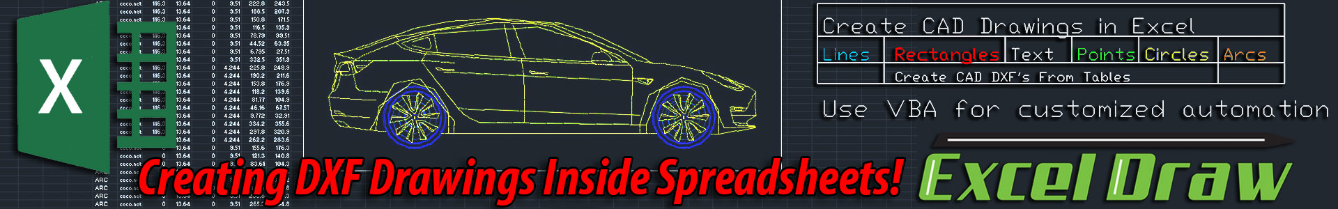
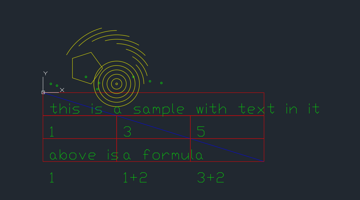
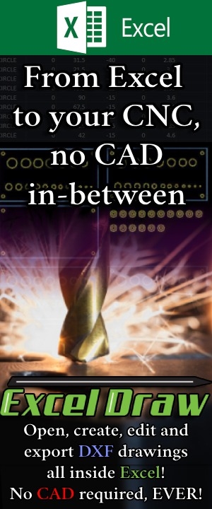
 Excel Draw is not exactly a 3D scatter plot maker, as it doesn't really make scatter plots. Instead, Excel Draw is a CAD style application that runs inside of Microsoft Excel. Using Excel Draw you can create 2D and 3D simple CAD style drawings, like blue prints and technical drawings. Using this you can create very impressive and interactive charts with rotations, zooming and even have the ability to export these drawings into DXF files.
Can produce precise and accurate scaled drawings/charts
Charts cannot be edited
Charts can be exported to other CAD applications
Can be used to create technical drawings
Has many other uses
Takes understanding of how CAD programs work
Can be complicated for new users
Paid for to unlock all features
Drawings not editable outside of Excel Draw(Scatter) Method 4: CelTools
 Just like above, CelTools does offer 3D graphing with XYZ data, but its not as robust as other methods.
Collection of features and functions
Easy selection method
Multiple graphing options
Cost effective alternative
Not a designated graphing tool
Only plots cube shaped data
No Lat. Long. Alt. data graphingConclusion
Want to get the most out of Excel?
![]()


