The Ultimate Guide to Crafting Captivating PowerPoint Experiences: Boost Engagement Now
Crafting Compelling PowerPoint Presentations: A Masterclass in Engagement
Introduction:
The ability to deliver compelling and engaging presentations is a skill that can set you apart. We’ve all endured the monotony of a lackluster PowerPoint, with slides drowning in text, bullet points, and generic clip art. It’s time to break free from the shackles of uninspiring presentations and embark on a journey toward crafting truly engaging PowerPoint experiences.
Why is this so important, you ask? In a world bombarded with information, attention spans have become precious commodities. A compelling presentation not only conveys your message effectively but also captures and maintains the audience’s attention. It’s a powerful tool for communication, persuasion, and knowledge transfer. Let’s delve into a comprehensive guide on creating presentations that not only inform but captivate your audience.


-
Clear and Concise Content:
Clarity is the cornerstone of effective communication. Keep your slides uncluttered, emphasizing key points to enhance audience understanding. Simplicity is the ultimate sophistication, allowing your message to shine without unnecessary distractions, which includes backgrounds.
Colorful backgrounds might be flashing, but your purpose of a presentation on the content, not the background. The best presentations are solid black backgrounds, which makes your content stand out and leaves less things for someone to focus on.

-
Engaging Visuals:
Visuals are the backbone of a memorable presentation. Utilize high-quality images, charts, and graphs to convey information visually. A well-chosen image can speak volumes, resonating with your audience and making your message more memorable.
-
Consistent Design:
Presentation design is your visual signature. Maintain a consistent theme, font, and color scheme throughout for a polished and professional look. Consistency fosters familiarity, ensuring your audience stays focused on your content.

-
Brief Bullet Points:
Bullet points are your allies, not adversaries. Limit text on each slide to concise bullet points, allowing your audience to absorb information without feeling overwhelmed. Each point should be a stepping stone in your narrative, guiding the audience through your story.
Most people even say the fewer words on the presentation, the better. Pick out the most ‘need to know’ things, and only write those words. No fluff, no smoke and mirrors, just cold hard facts that are needed, and that’s all!
-
Storytelling Flow:
Transform your presentation into a narrative journey. Structure it with a clear beginning, middle, and end to captivate your audience. A well-crafted story not only educates but also emotionally engages, leaving a lasting impression.
People love to be told stories; they hate to be narrated to. Don’t read your slides, use them as reminders and craft everything you tell into a story. Even poorly written stories still captivate audiences.

-
Relevant Transitions:
Transitions are the glue that holds your presentation together. Choose transitions wisely to create a seamless flow between slides. When used appropriately, transitions enhance the overall cohesion and rhythm of your presentation.
Don’t linger too long on one, and don’t rush through others. A smooth transition is key for attention.
At Minimum: 30 seconds per slide.
At Most: 2 Minutes per slide.
-
Font Legibility:
Fonts are your silent communicators. Ensure text is easily readable by selecting appropriate styles and sizes. Titles and important information should be presented in a font that commands attention, promoting readability and comprehension.
Keep text slim and concise. The text is there for you, to remind you what comes next. It is an added bonus for the viewer, who is listening to a story, remember?
-
Contrast for Visibility:
Achieving visibility is not just about brightness; it’s about contrast. Use high contrast between text and background to improve visibility, especially when presenting in various environments. A clear visual hierarchy ensures that your message takes center stage.
What is best is White Text on a Black Background. Stands out great. For color pops, Red, Green and Orange.

-
Practice Timing:
Precision in timing is a mark of professionalism. Rehearse your presentation to ensure it fits within the allocated time. A well-paced delivery not only keeps your audience engaged but also demonstrates your mastery of the content.
-
Audience Interaction:
Turn your presentation into a conversation. Include questions, polls, or discussion points to engage your audience actively. Interaction fosters a sense of involvement, making your presentation a collaborative experience.

-
Minimalist Approach:
Embrace the power of simplicity. A minimalist design emphasizes essential content, eliminating unnecessary elements that can divert attention. Clarity and focus become your allies in delivering a potent message.

-
Use of Icons:
Icons are the visual shorthand of your presentation. Incorporate relevant icons to convey ideas quickly and enhance the visual appeal of your slides. Icons provide visual cues, aiding in the swift comprehension of complex concepts.
-
Data Visualization:
Numbers can be daunting; visuals make them accessible. Transform data into clear visuals, such as charts or infographics, for a more compelling and digestible presentation of information. Data visualization adds context and meaning, enhancing the audience’s understanding.
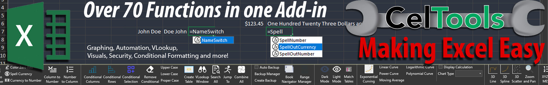
Speaking of which, if you want some pretty neat 3D graphs in Excel, why not check out XYZ Mesh? It can graph surfaces, meshes, lidar, 3D lines, 3D scatter plots and more. Check it out!
-
Professional Templates:
Templates are your design assistants. Utilize professionally designed PowerPoint templates to add a polished and cohesive look to your presentation. A well-crafted template provides a visually appealing backdrop, elevating the overall aesthetic.
Again, these need to be picked with caution. Too distracting and you lose your audience. Stick with black slides.

-
Effective Use of White Space:
White space is the breathing room of your presentation. Embrace it to reduce clutter, allowing your audience to focus on key elements. White space provides visual balance, enhancing overall aesthetics.
-
Engaging Titles:
Titles are your headlines, drawing your audience into each slide. Craft compelling and descriptive slide titles that provide context and draw attention to the main message. A well-crafted title sets the tone for what follows.

-
Consistent Font Hierarchy:
Fonts convey hierarchy, guiding your audience through information. Maintain a clear font hierarchy with larger fonts for titles and smaller fonts for supporting text. A consistent hierarchy enhances readability and emphasizes key points.
I personally go for a professional look that is clean and easy to read. Calibri and Helvetica stand out to me as my go-to fonts.
-
Relevant Animations:
Animations are your storytelling tools. Apply them sparingly to emphasize key points or reveal information gradually. Thoughtful use of animations adds a dynamic element to your presentation, capturing your audience’s attention.
But use them sparingly. Too many and it gets stale and over used. People like different, people hate the same. By doing something more than once, or twice as a tie in, it becomes ‘samey’ and annoying.

-
Proofread and Edit:
Typos and errors are the foes of professionalism. Thoroughly proofread your content to eliminate errors and ensure a polished presentation. Attention to detail reflects your commitment to delivering quality information.
-
Incorporate Multimedia:
Multimedia elements enrich your presentation experience. Integrate videos or audio clips to add variety and enhance engagement. Multimedia elements provide a multisensory experience, making your presentation more dynamic.
Like before, yes, but use it sparingly.

-
Custom Slide Sizes:
Tailor your slides to fit the presentation format. Consider customizing slide sizes for specific formats, such as widescreen or square, depending on the platform. Customization ensures your presentation adapts seamlessly to diverse settings.
The best thing to do is know the size before you get started. If this is not an option, assume you will be working on a 4:3 resolution (which is pretty much a square – 800×600 ), as most older projectors work at this resolution. If you work at this resolution, then your slides will be visible at all resolutions. However, if you are working on a 1980×720 resolution (wide screen) and your presentation is going to be on a 4:3, then prepare for your slides to be less than half the size you were expecting (because it needs to be shrunk down to fit on a smaller screen – turning a 1980×720 into a 800×290… couch).

-
Effective Use of Color:
Colors set the tone and mood of your presentation. Choose a palette that aligns with your topic and brand, evoking the desired emotions. A well-thought-out color scheme creates visual cohesion and reinforces your message.
-
Captivating Openings and Closings:
Openings and closings are your presentation’s bookends. Begin with a captivating introduction that grabs your audience’s attention. End with a memorable conclusion that leaves a lasting impression. Bookend your presentation with impact.
Having trouble opening the presentation? The best way to start a presentation is with a personal story. Try and find one that is related to the topic, great. If not, oh well. This strategy is used to introduce you to the audience, letting them realize and relate to you which causes them to be more sympathetic and relate to you more.
What about ending the presentation? Well the best ending ties back into the beginning. If you used a personal story, then great, just tie back into it. Think of any comedian. Their whole job is telling a story (like you are doing with the presentation). They make a sly joke at the beginning, that means nothing then, but at the end they tie back into the joke and it makes you remember how it all started.
This is a great way to end a presentation and will always leave a good impression.

-
Use Speaker Notes Wisely:
Speaker notes are your personal guide. If applicable, use them to provide additional context without cluttering the slides with too much text. Speaker notes act as your safety net, ensuring you stay on track during the presentation.
But the best way is to simply practice and keep the notes (small notes) in the slide. That way you are not holding anything and there is not a barrier between you and the audience.
-
Feedback and Iteration:
Continuous improvement is the hallmark of a skilled presenter. Gather feedback from peers or mentors and iterate on your presentation. A willingness to refine and enhance your content demonstrates your commitment to delivering excellence.
Conclusion:
As you embark on your journey to create compelling PowerPoint presentations, remember the importance of captivating your audience. Each slide is an opportunity to inform, engage, and leave a lasting impression. Whether you’re presenting in a boardroom, classroom, or virtual setting, mastering the art of PowerPoint is your ticket to effective communication. So, embrace these tips, channel your creativity, and let your presentations shine. After all, a well-crafted PowerPoint is not just a presentation – it’s an experience and a story that you are telling.
- #PowerPointTips
- #PresentationSkills
- #EngagingSlides
- #VisualCommunication
- #StorytellingInBusiness
- #EffectiveDesign
- #SpeakerSuccess
- #AudienceEngagement
- #VisualStorytelling
- #PresentationDesign
- #ProfessionalPresenting
- #PowerPointMastery
- #ContentClarity
- #TechTuesday
- #BusinessCommunication


