Excel Mastery: Crush Your Spreadsheets Like a Pro! Part 3.3 – Formatting Tables
Excel Mastery: Crush Your Spreadsheets Like a Pro!
Part 3.3
Formatting tables


Ah, Excel, the go-to tool for data organization and analysis. If you’re anything like me, you’ve spent countless hours staring at an Excel sheet, trying to make sense of all those numbers and figures. Well, fear not, my fellow data enthusiasts, for today we’re going to delve into the world of formatting data in Excel, specifically tables and a little about charts. Actually, just a brief look at charts, because charts are so expansive that we have a whole series of post dedicated just to them.
Tables
Let’s start with tables. Now, I know what you’re thinking, “Tables? Really? That sounds about as exciting as watching paint dry.” But trust me, tables are where the magic happens. They allow you to organize your data in a clear and concise manner, making it easier to spot trends and patterns.
But here’s the thing, tables can be pretty dull. Rows and columns of numbers can quickly become overwhelming and frankly, boring. That’s where formatting comes in. By using different fonts, colors, and borders, you can transform a bland table into a work of art. Okay, maybe not a work of art, but at least something that won’t put you to sleep.
How to make a table
Here is a step-by-step guide on how to make and use tables in Excel:
Step 1: Getting the data started
Open up Excel and start plugging in some data. Start with the header section and then include the data as follows.

Step 2: Create a Table
Select the range of data that you created and click on the “Insert” tab and select “Table” from the drop-down menu. This will bring up a dialog box where you can select the data range (if not previously selected) that you want to turn into a table.


Step 3: Format Your Table
Now that you have a table, it’s time to make it look nice. You can change the font, color, and other formatting options by using the “Table Styles” and “Design” tabs. Be sure to pick a style that matches your personality – I personally like the “Comic Sans” font, but that’s just me. That was a joke. Please don’t use Comic Sans….
Step 4: Sort and Filter Your Data
Once you have your data in the table, you can sort and filter it to make it easier to read. For example, you can sort the data by date, alphabetically, or by numerical value. You can also filter the data to only show certain values, such as sales from a specific region.
To do this, click on the arrow next to the column header you want to sort and pick your criteria.


Step 5: Use Formulas in Your Table
Excel is famous for its powerful formulas, and you can use them in your tables too. For example, you can use the “SUM” formula to add up all the values in a column, or the “AVERAGE” formula to calculate the average value. If you’re feeling really fancy, you can even use nested formulas to do some seriously complex calculations.
This is a section that we will cover in depth more later, but just know that you can include functions and formulas to make your tables even more rad! (oh Lord, I hope I don’t get smitted down from all my outdated lingo)
 If you don’t understand how to include formulas yet, don’t worry, you will soon. In an upcoming chapter we are going to cover functions, formulas and macros. Just stay tuned and you will be in the know before you know it!
Step 6: Make a Chart from Your Table
Finally, once you have your data organized and formatted the way you want, you can create a chart to visualize the data. Just select the data range you want to include in the chart, click on the “Insert” tab, and select the type of chart you want to create. And just like that, you’ve turned a boring table into a colorful, eye-catching chart!

 Again, we will cover this more later. For now, just know you can. Either that, or if all else fails, throw in a cat picture. Everyone loves cat pictures. That will get the attention of at least 50% of the viewers.
And there you have it – a step-by-step guide to making and using tables in Excel. Just remember to have fun with it, and don’t be afraid to experiment with different styles and formatting options. Who knows, you might just become the next Excel superstar!
More Advanced Things
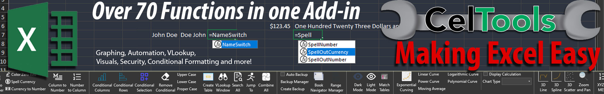
If you are really looking to improve your Excel skills, you might want to look into the Add-in CelTools. Not only do we give great advice on how to use Excel, but we also offer great products that make Excel easier to use.
CelTools, like all of our other products, receive new updates that improve functionality and add new features. Features like easily creating tables, using Vlookup and doing conditional formatting by Column or Row. While its true that you do not need CelTools (because I am going to be showing how to do everything that CelTools offers over the series of these post), CelTools makes it a lot easier as it allows you to do these things without writing your own functions.

Converting numerical numbers to written numbers (123 to One Hundred Twenty Three), printing selections into PDF’s, and even saving Excel pages as HTML so you can post it directly on your website.
Anyway, give CelTools a try and see what it can do for you. There is no harm in downloading the free trial!


