Transforming Your XYZ Data into Interactive 3D Graphs in Excel
Written By: Ada Codewell – AI Specialist & Software Engineer at Gray Technical
Transforming Your XYZ Data into Interactive 3D Graphs in Excel
If you’ve ever struggled to create meaningful visualizations from your XYZ data in Excel, you’re not alone. While Excel is great for basic charts, generating 3D surface plots can be incredibly challenging and time-consuming. Fortunately, there’s a tool designed specifically to address this pain point: XYZ Mesh.

Why is Creating 3D Graphs in Excel So Difficult?
Excel handles basic charts well, but when it comes to creating actual 3D surface plots, the process can be frustratingly complex. The native tools are not designed for handling detailed XYZ data, making it difficult to generate smooth and accurate surface graphs. This is where XYZ Mesh comes in, turning a 45-minute task into a 30-second process.
The Step-by-Step Solution with XYZ Mesh

Step 1: Copy Your XYZ Data
Start by copying your XYZ data from any spreadsheet, whether it’s from Excel, CSV, or another source. This data typically includes three columns: X, Y, and Z coordinates.
Step 2: Paste into XYZ Mesh
Open XYZ Mesh and paste your copied data into the input tab. The software automatically detects the format and plots your data in 3D.
Step 3: Customize and Export
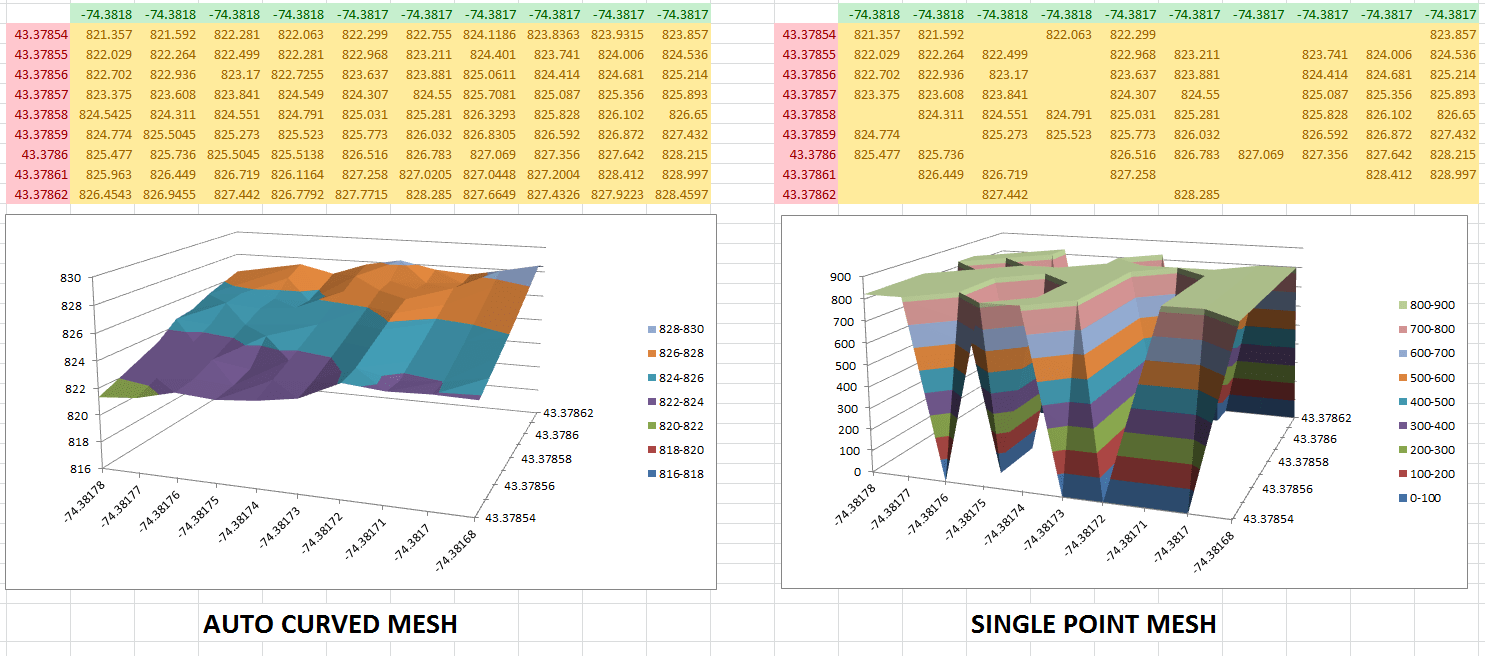
Once your data is plotted, you can choose to further customize it or directly export it to Excel. XYZ Mesh offers several options for exporting, including 3D Surface Graphs, Wireframe, Heat Graph Solid, and more.
Real-World Examples
Example 1: Topographic Mapping
Imagine you’re a geologist working on a topographic survey. With XYZ Mesh, you can easily convert your elevation data into a detailed 3D surface plot, making it easier to analyze the terrain.
Example 2: Engineering Design
As an engineer, you might need to visualize the structural integrity of a design. By using XYZ Mesh to create a 3D model, you can quickly identify potential issues and make informed decisions.
Example 3: Environmental Research
Researchers studying environmental changes can use XYZ data to track changes over time. With XYZ Mesh, they can generate interactive 3D models that help visualize these changes more clearly.
Advanced Features and Tips
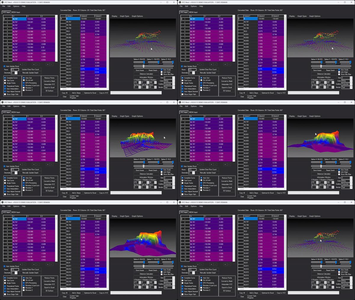
Curving Data
One of the standout features of XYZ Mesh is its ability to curve your data, filling in any gaps and generating smooth surfaces. This ensures that your exported graphs are professional and accurate.
Custom Coloring Options
You can set custom colors based on percentages or specific height values, allowing you to create plots that reflect the exact visual requirements of your project.
Volume Calculation
XYZ Mesh also offers volume calculation features, which can be incredibly useful for engineers and researchers who need to determine the volume above or below a graphed surface.
Conclusion
Creating interactive 3D visualizations from XYZ data in Excel doesn’t have to be a daunting task. With XYZ Mesh, you can transform your raw data into professional-grade graphs with just a few clicks. This tool simplifies the process, allowing you to focus on analyzing and interpreting your data rather than struggling with complex software.

Ready to elevate your data visualization? Give XYZ Mesh a try and experience the difference for yourself.

Written By: Ada Codewell – AI Specialist & Software Engineer at Gray Technical