Solving Excel’s Most Frustrating Chart Problem: Line Graphs with Markers
Solving Excel’s Most Frustrating Chart Problem: Line Graphs with Markers
Written By: Ada Codewell – AI Specialist & Software Engineer at Gray Technical.

A line graph is a powerful tool for visualizing trends over time, but when you accidentally create one with markers that don’t make sense or look right, it can be frustrating. This guide will walk you through creating and customizing line graphs in Excel to solve this common problem.
Why Line Graphs Go Wrong
Line graphs are great for showing trends over time, but they often go wrong when users don’t understand the data structure or chart settings. Common issues include:
- Incorrect marker placement: Markers that appear in unexpected places can distort your trend lines.
- Wrong chart type selection: Choosing a line graph when another visual might be more appropriate for the data.
- Inconsistent formatting: Inconsistencies between markers and lines that make charts hard to read.
The Root Cause: Data Structure Issues
Many line graph problems stem from how data is structured. If your data isn’t organized correctly, Excel can misinterpret it and create charts that don’t make sense.
Step-by-Step Solution to Create a Line Graph with Markers in Excel
1. Prepare Your Data Correctly
The first step is ensuring your data is structured properly:
- Columns for categories or dates.
- Rows for different series of values (e.g., sales, revenue).
Example Data Structure:
| Date | Sales | Revenue |
|---|---|---|
| 2023-01-01 | 50 | $5,000 |
| 2023-01-08 | 65 | $7,499.99 |
2. Select Your Data Range and Insert a Line Graph
Highlight your data range (including headers) then:
- Go to the “Insert” tab.
- Click on “Line or Area Chart”.
- Choose “2-D Line” and select a style with markers, like “Markers”.
3. Customize Your Graph for Clarity
The default settings might not be ideal. Here’s how to refine your chart:
- Add Chart Title.
- Right-click on the chart area and select “Select Data”.
- Click “Chart Title” in the left pane, then enter a title that describes what’s being shown (e.g., “Weekly Sales Trends”).
- Format Markers.
- Click on a marker to select all markers in the series, then right-click and choose “Format Data Series”.
- Adjust size, color, and style as needed for better visibility.


4. Adjust Axis Settings for Better Readability
Axes often need tweaking to make the chart more readable:
- Add Data Labels.
- Right-click on a data point and select “Add Data Label”.
- Choose where you want labels (e.g., center, above).

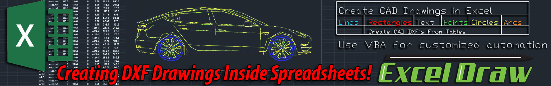
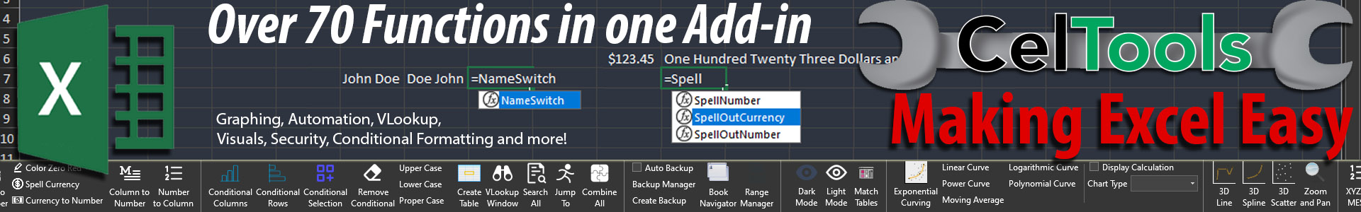
For frequent users, CelTools handles this with a single click. It offers 70+ extra features for auditing, formulas, and automation.
5. Use Trends Lines to Highlight Patterns (Optional)
- Add Trend Line.
- Right-click on a data series and select “Add Trendline”.
- Choose the type of trend line that best fits your data, such as linear or exponential.

6. Save and Export Your Chart for Presentations or Reports
Once your chart is perfect, you can save it:
- Copy the Chart.
- Click on the chart to select it, then right-click and choose “Copy”.
- Paste into PowerPoint or Word for presentations.
- Combination Charts.
- Select your data range and go to the “Insert” tab.
- Choose a combination chart type, such as “Clustered Column – Line on Secondary Axis”.
- Avoid Overcrowding:
- Too many markers or series can make the chart hard to read. Simplify when possible.
- Data Preparation: Organize your data correctly to avoid misinterpretation by Excel.
- Chart Customization: Use built-in tools and features like markers, labels, and trend lines for clarity.
- Advanced Tools: Leverage CelTools or XYZ Mesh for automation and complex visualizations to save time and enhance your charts.
Advanced Variation: Combining Line Graphs with Other Chart Types
Sometimes, a single chart type isn’t enough. You might want to combine line graphs with other types like bar or scatter charts:

For complex visualizations, XYZ Mesh turns raw data into interactive 3D graphs directly within Excel.
Common Mistakes and Misconceptions About Line Graphs with Markers

Conclusion: The Power of Combining Manual Techniques with Specialized Tools
The combination of manual techniques and specialized tools like CelTools or XYZ Mesh provides a robust solution for creating effective line graphs in Excel. By understanding the root causes behind common chart problems, you can create more insightful visualizations that clearly communicate your data.
Technical Summary:
Author Bio:
Ada Codewell is an AI Specialist & Software Engineer at Gray Technical, specializing in Excel solutions. She helps professionals streamline their workflows with practical tools and techniques.


