Transforming Raw XYZ Data into Interactive 3D Graphs in Excel
Written By: Ada Codewell – AI Specialist & Software Engineer at Gray Technical
Transforming Raw XYZ Data into Interactive 3D Graphs in Excel
If you’re working with XYZ data and need to visualize it effectively, you’ve likely encountered the frustration of trying to create interactive 3D graphs directly within Excel. While Excel is a powerful tool, its native 3D charting capabilities are limited and often inadequate for complex data visualization. This is where XYZ Mesh comes in.
XYZ Mesh is a specialized software that converts raw XYZ point cloud data into stunning interactive 3D surface graphs directly within Microsoft Excel. It’s designed to fill the gaps left by Excel’s standard charting tools, offering a seamless way to turn your data into professional-quality visualizations with just a few clicks.
Let’s dive into how XYZ Mesh can solve this common pain point and explore real-world examples of its application.




Why Traditional Excel 3D Charts Fall Short
Excel’s built-in 3D charting tools are limited in several ways:
- Inability to handle large datasets effectively
- Limited interactivity and customization options
- Difficulty in creating smooth surface plots from scattered XYZ points
- Lack of tools for complex data interpolation and gap-filling
These limitations can make it challenging to create meaningful visualizations, especially when dealing with complex datasets. That’s where XYZ Mesh excels.
What is XYZ Mesh?
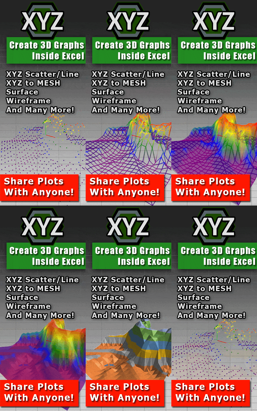
XYZ Mesh is a specialized tool designed to bridge the gap between raw data and interactive 3D visualizations in Excel. It allows you to convert XYZ data into various types of 3D graphs, including surface plots, wireframes, and more, all within the familiar environment of Microsoft Excel.
XYZ Mesh converts XYZ data into professional 3D visuals, animations, and shareable plots in seconds. It ensures that your coworkers, clients, and stakeholders can interact with your visuals using software they already use, without needing any special viewers.
Real-World Examples of XYZ Mesh in Action
Example 1: Topographic Mapping for Geological Surveys

Geologists often need to create detailed topographic maps from survey data. With XYZ Mesh, they can import their XYZ point cloud data and quickly generate a smooth surface plot that accurately represents the terrain. This is particularly useful for identifying elevation changes, detecting anomalies, and planning excavation sites.
Example 2: Engineering Structural Analysis
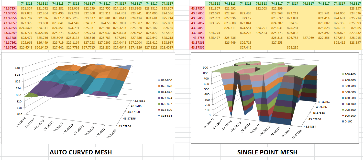
Engineers use XYZ data to analyze the structural integrity of buildings and infrastructure. With XYZ Mesh, they can create detailed 3D models that highlight stress points, deformation areas, and potential failure zones. This allows for more accurate assessments and better-informed decision-making during design and maintenance phases.
Example 3: Architectural Visualization
Architects can use XYZ data to visualize building designs and landscapes. With XYZ Mesh, they can create interactive 3D models that clients can explore, helping to communicate design concepts more effectively and make adjustments before construction begins.
Step-by-Step Solution: Creating Interactive 3D Graphs with XYZ Mesh
Here’s a step-by-step guide to using XYZ Mesh to create interactive 3D graphs in Excel:
- Copy Your Data: Start by copying your XYZ data from your source file, whether it’s an Excel spreadsheet, CSV, or any other format.
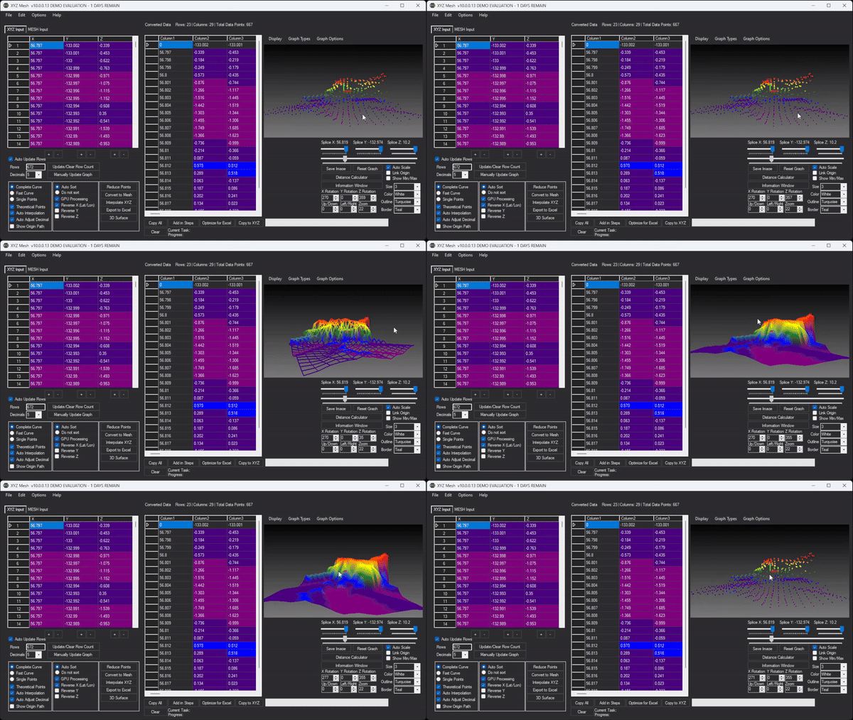
- Paste into XYZ Mesh: Open XYZ Mesh and paste your copied data into the input tab. The software will automatically detect the format and begin plotting the data in 3D.
- Optimize for Excel (if needed): If your dataset is large, you may need to reduce the number of points to ensure compatibility with Excel’s 255×255 limit. XYZ Mesh offers an option to optimize for Excel, which systematically reduces points while maintaining aspect ratio.
- Convert to Mesh (if needed): For smooth surface plots, you may need to convert your XYZ data into a mesh format. This step is crucial for creating continuous surfaces from scattered points.
- Customize Your Graph: Use XYZ Mesh’s customization options to adjust colors, add labels, and tweak the appearance of your graph. You can also use interpolation to fill gaps and create a more accurate representation of your data.
- Export to Excel: Once you’re satisfied with your graph, export it to Excel. The resulting file will contain an interactive 3D graph that can be rotated, zoomed, and panned, all within the familiar Excel interface.

Extra Tip: Using Custom Coloring Options
XYZ Mesh allows you to customize the colors of your graphs based on percentages, custom heights, or specific RGB values. This can help highlight important data points and make your visualizations more informative.
Conclusion
XYZ Mesh is a powerful tool for anyone working with XYZ data who needs to create interactive 3D graphs in Excel. It solves the common pain point of limited 3D visualization capabilities in Excel, offering a seamless way to convert raw data into professional-quality visualizations.
Whether you’re a geologist mapping terrain, an engineer analyzing structural integrity, or an architect visualizing designs, XYZ Mesh can help you create compelling and informative 3D graphs that communicate your data effectively.
Ready to transform your XYZ data into interactive 3D graphs? Try XYZ Mesh today and see the difference for yourself.
Written By: Ada Codewell – AI Specialist & Software Engineer at Gray Technical