Transforming Complex Data into Interactive 3D Graphs with XYZ Mesh
Written By: Ada Codewell – AI Specialist & Software Engineer at Gray Technical
Transforming Complex Data into Interactive 3D Graphs with XYZ Mesh
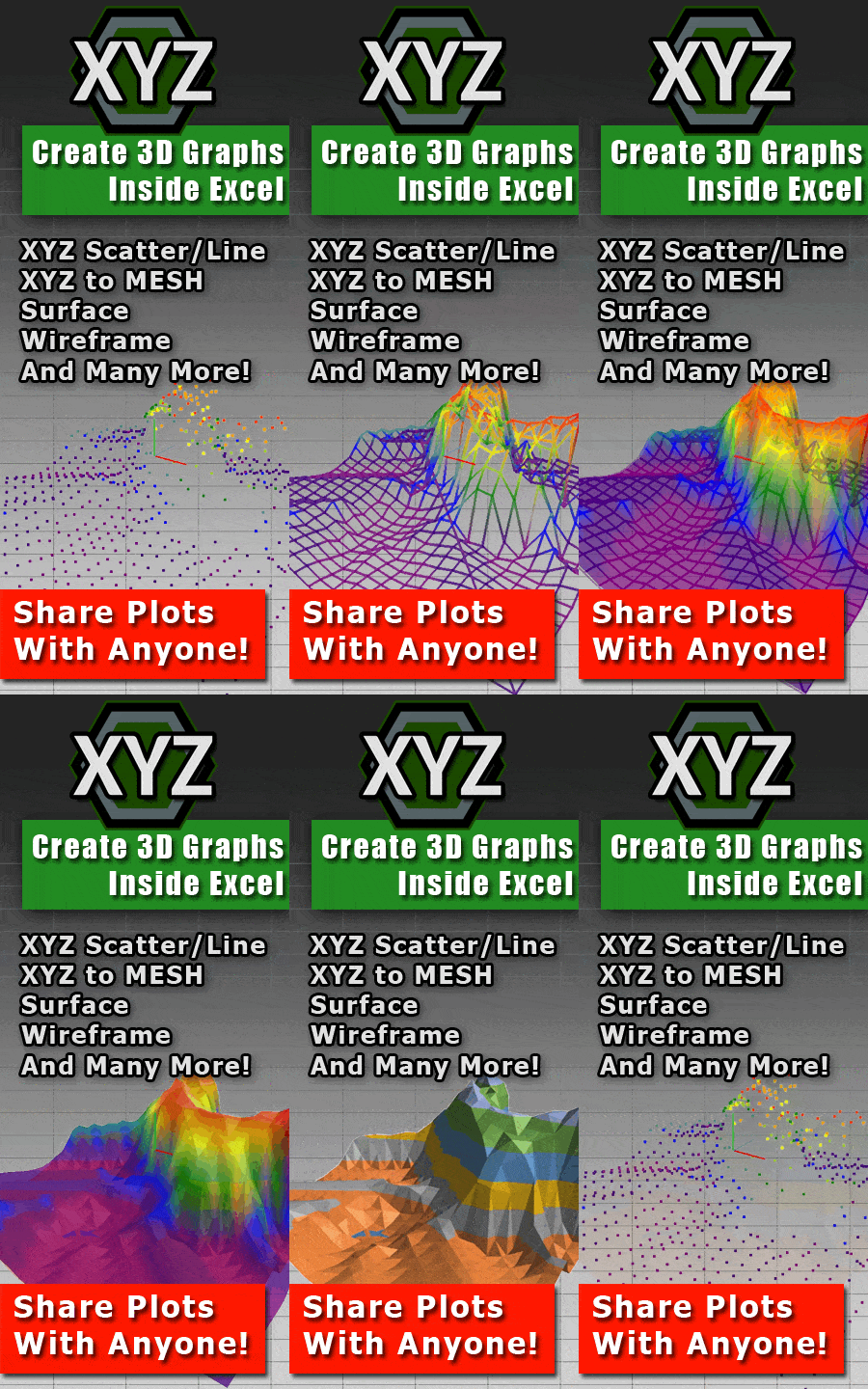
Are you tired of struggling with Excel’s limited chart capabilities when trying to visualize complex XYZ data? Many professionals find it challenging to create accurate and interactive 3D surface plots directly in Excel. This is where XYZ Mesh comes in—a powerful tool designed to turn raw XYZ data into stunning, interactive 3D graphs within seconds.




The Problem: Excel’s Limitations with 3D Visualization
Microsoft Excel is a versatile tool for data analysis, but it has significant limitations when it comes to creating complex 3D visualizations. Traditional Excel charts often fall short in representing intricate XYZ point cloud data accurately. This can be frustrating for professionals who need to present detailed 3D models to stakeholders, clients, or team members.
Why It Happens
Excel’s built-in charting tools are not designed to handle the intricacies of XYZ data. The software struggles with data gaps, curve calculations, and interactive features necessary for professional presentations. This limitation is particularly problematic for fields like surveying, engineering, and geology, where accurate 3D visualization is crucial.
Real-World Examples
Let’s look at three real-world scenarios where XYZ Mesh could be a game-changer:
- Surveyors and Geologists: When surveying land or creating topographical maps, professionals need to visualize elevation data accurately. Traditional Excel charts can’t handle the complexity of terrain data, leading to inaccurate representations.
- Engineers: Civil engineers often work with XYZ point cloud data from lidar scans or drone surveys. Converting this data into a meaningful 3D model in Excel is nearly impossible without specialized tools like XYZ Mesh.
- Researchers: In scientific research, visualizing 3D data sets is crucial for presenting findings. Whether it’s medical imaging or geological studies, researchers need tools that can create detailed and interactive 3D models.
Step-by-Step Solution with XYZ Mesh
XYZ Mesh simplifies the process of converting XYZ data into professional-grade 3D visualizations. Here’s how you can use it:
Step 1: Prepare Your Data
Gather your XYZ data from Excel, CSV, or any spreadsheet format. This data should include X, Y, and Z coordinates representing the points in 3D space.

Step 2: Copy and Paste into XYZ Mesh
Open XYZ Mesh and paste your data into the input window. The software automatically detects the format and begins plotting the data in 3D.
Step 3: Customize Your Graph
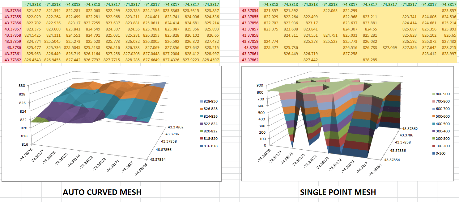
Use XYZ Mesh’s features to customize your graph. You can adjust colors, interpolate data points, and even fill in gaps to create a smooth surface. The software’s intuitive interface makes it easy to manipulate the data for optimal visualization.
Step 4: Export to Excel or Other Formats
Once your graph is perfect, you can export it directly to Excel. XYZ Mesh supports multiple formats, including DXF (for CAD), KML (for Google Earth), and more. The exported files are fully interactive, allowing viewers to rotate, zoom, and interact with the 3D model.

Extra Tip: Optimizing for Excel
If your data set is too large for Excel to handle, use XYZ Mesh’s “Optimize for Excel” feature. This tool systematically reduces the number of points while maintaining the aspect ratio, ensuring that your graph fits within Excel’s 255×255 limit.
Conclusion
XYZ Mesh is a powerful solution for professionals who need to visualize complex XYZ data in 3D. With its intuitive interface and robust features, it transforms the tedious process of creating 3D graphs into a simple, efficient task. Whether you’re a surveyor, engineer, or researcher, XYZ Mesh provides the tools you need to create stunning, interactive visualizations.
Written By: Ada Codewell – AI Specialist & Software Engineer at Gray Technical