Solving XYZ Data Challenges with Interactive 3D Graphs in Excel
Written By: Ada Codewell – AI Specialist & Software Engineer at Gray Technical
Solving XYZ Data Challenges with Interactive 3D Graphs in Excel
If you’re working with XYZ data and struggling to visualize it effectively in Excel, you’re not alone. Creating meaningful 3D graphs from raw XYZ data can be a daunting task, but there’s a solution that can make your life easier: XYZ Mesh. In this article, we’ll explore the common challenges of working with XYZ data in Excel and show you how XYZ Mesh can solve these issues step-by-step.
Why This Problem Happens
Excel is a powerful tool for data analysis, but it has limitations when it comes to creating complex 3D graphs. The built-in charting features are not designed to handle XYZ data effectively, which often leads to frustration and time-consuming workarounds.
Real-World Examples
Let’s look at three real-world examples where professionals struggle with XYZ data visualization in Excel:
Example 1: Geological Surveys

Geologists often collect XYZ data during surveys to map subsurface formations. Visualizing this data in 3D is crucial for understanding the terrain and making informed decisions, but Excel’s basic tools fall short in providing a clear and interactive representation.
Example 2: Environmental Monitoring
Environmental scientists use XYZ data to monitor changes in landscapes, such as erosion patterns or water levels. Creating accurate and interactive 3D graphs is essential for analyzing trends and presenting findings to stakeholders.
Example 3: Engineering Designs
Engineers working on infrastructure projects need to visualize XYZ data to design and analyze structures. Traditional Excel charts are often insufficient for this purpose, making it difficult to convey complex spatial relationships.
Step-by-Step Solution with XYZ Mesh
XYZ Mesh is designed to overcome these challenges by providing an easy way to convert raw XYZ data into interactive 3D graphs directly in Excel. Here’s a step-by-step guide on how to use it:
Step 1: Install XYZ Mesh
![]()
First, download and install XYZ Mesh from the official website. The installation process is straightforward and guided by an intuitive interface.
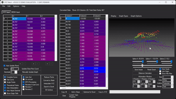
Step 2: Import Your XYZ Data
Once installed, open XYZ Mesh and import your XYZ data. You can copy and paste the data directly into the input tab or import it from a CSV file.
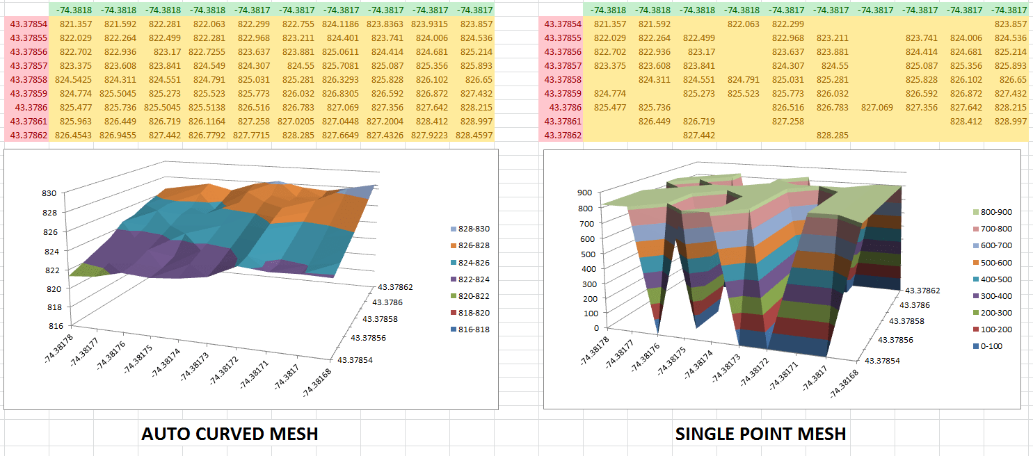
Step 3: Convert Data to MESH
Use XYZ Mesh to convert your XYZ data into a MESH format. This process fills in gaps and interpolates missing data points, ensuring a smooth and accurate representation of your dataset.
Step 4: Create Interactive 3D Graphs
Export your MESH data to Excel, where you can create interactive 3D graphs. These graphs allow you to zoom, rotate, and pan, providing a comprehensive view of your data.
Step 5: Share Your Visualizations

Once your graphs are ready, you can easily share them with colleagues or stakeholders. XYZ Mesh ensures that all data and visualizations are contained within the exported Excel file, making it accessible to anyone with Excel.
Extra Tip: Customizing Your Graphs

XYZ Mesh offers customization options to tailor your graphs to specific needs. You can adjust colors, add textures, and even create interactive environments with assets like trees and rocks. This level of customization makes your visualizations more engaging and informative.
Conclusion
Visualizing XYZ data in Excel doesn’t have to be a frustrating experience. With XYZ Mesh, you can easily convert raw XYZ data into interactive 3D graphs, making your data analysis more effective and your presentations more impactful.
Try XYZ Mesh today and see how it can transform your workflow. Download the free trial here and start creating stunning 3D visualizations in Excel.

Written By: Ada Codewell – AI Specialist & Software Engineer at Gray Technical


