Solving the XYZ Data Visualization Challenge with Excel
Written By: Ada Codewell – AI Specialist & Software Engineer at Gray Technical
Solving the XYZ Data Visualization Challenge with Excel
![]()
One of the most frustrating challenges for engineers, geologists, and data scientists is visualizing XYZ data in Excel. While Excel is powerful, creating professional-grade 3D visualizations from raw XYZ data can be daunting. This is where XYZ Mesh comes to the rescue, offering a streamlined solution for turning raw XYZ data into interactive 3D graphs directly in Excel.
Written By: Ada Codewell – AI Specialist & Software Engineer at Gray Technical
Why This Problem Happens
Creating accurate 3D visualizations from XYZ data in Excel is difficult for several reasons:
- Excel lacks native support for complex 3D graphing.
- Manual data interpolation and curve fitting are time-consuming and error-prone.
- Sharing interactive 3D plots is challenging without additional software.
Three Real-World Examples
Example 1: Geological Survey Data
Geologists often need to visualize subsurface formations. With XYZ Mesh, they can import their survey data directly into Excel and create detailed 3D surface models that reveal the intricate layers of shale or mineral deposits.

Example 2: Oceanic Research
Oceanographers collect depth data from various points in the ocean. Using XYZ Mesh, they can convert this raw data into a 3D scatter plot or surface model, making it easier to analyze underwater terrain and identify trends.
Example 3: Environmental Conservation
Conservationists map out areas affected by deforestation or climate change. With XYZ Mesh, they can create interactive 3D models that help stakeholders visualize the impact and plan mitigation strategies.
Step-by-Step Solution
XYZ Mesh simplifies the process of creating 3D visualizations from XYZ data. Here’s how:
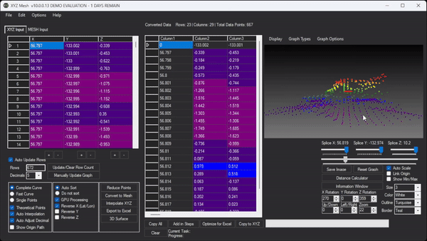
1. Import Your Data
Copy your XYZ data and paste it into the XYZ input tab of XYZ Mesh.
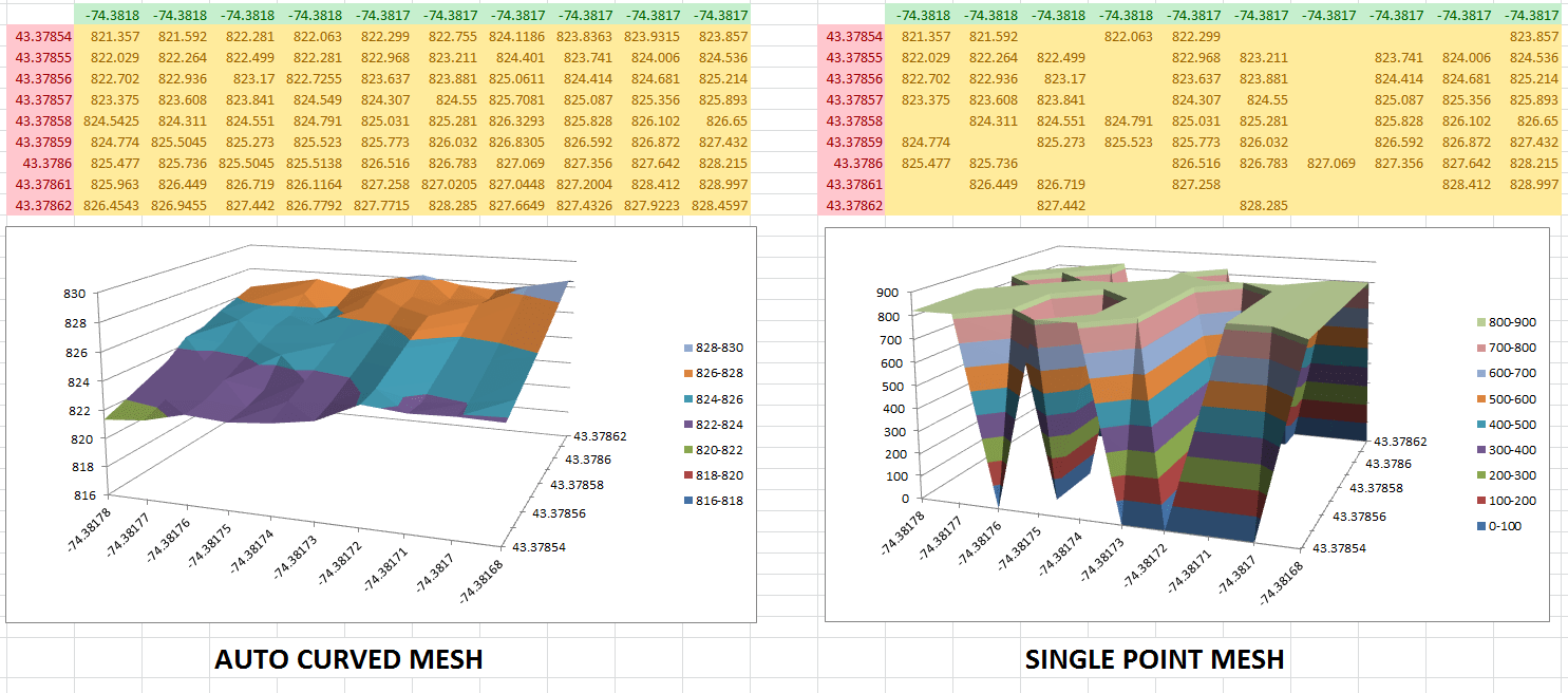
2. Convert to Excel Mesh
Click on the “Convert to Mesh” button. XYZ Mesh will automatically interpolate and fill in any gaps, ensuring a smooth surface graph.
3. Customize Your Graph
Use the custom coloring options to set colors based on percentages or specific heights. You can also adjust the scale and axis settings to fit your needs.
4. Export to Excel
Click “Export to Excel” to generate a 3D surface model that you can share with clients or colleagues. The exported file contains all data, graphs, and plots, making it easy for anyone to view and interpret your data.

Extra Tip: Interpolate Without Mesh
If you don’t want to convert your data to MESH but still need to fill in gaps, use the “Interpolate XYZ” feature. This will produce new data points without changing the format, ensuring a more accurate representation of your data.
Watch How It’s Done
Conclusion
XYZ Mesh is a game-changer for anyone dealing with XYZ data in Excel. It simplifies the process of creating 3D visualizations, making it easier to share and interpret your data. Whether you’re a geologist, oceanographer, or conservationist, XYZ Mesh offers a powerful solution for all your data visualization needs.

Try XYZ Mesh today and experience the difference for yourself. With a 5-day completely unlocked evaluation period, you have nothing to lose and everything to gain.


