Unlocking the Power of XYZ Data: Creating Stunning 3D Surface Graphs in Excel
Written By: Ada Codewell – AI Specialist & Software Engineer at Gray Technical
Unlocking the Power of XYZ Data: Creating Stunning 3D Surface Graphs in Excel
Working with XYZ data in Excel can be frustrating. While Excel handles basic charts well, creating actual 3D surface plots is difficult and time-consuming. Many professionals struggle with this issue, leading to hours wasted on formatting and manual adjustments.
Why does this happen?
Excel’s built-in tools are not designed for complex 3D visualizations. The standard chart types simply don’t offer the flexibility needed to create detailed surface plots from XYZ data. Users often have to settle for flat, uninformative graphs that don’t convey the full story of their data.
Why This Problem Happens
Creating 3D surface plots in Excel is challenging due to several factors:
- Excel lacks native support for true 3D plotting beyond basic surface charts.
- Manual formatting and adjustments are time-consuming and error-prone.
- The need for customization often outstrips what Excel’s built-in tools can offer.
As a result, professionals often resort to cumbersome workarounds or specialized software that may not integrate well with Excel. This leads to inefficiencies and potential inaccuracies in data representation.
Real-World Examples
Example 1: Geological Surveys
Geologists often need to visualize topographical data to understand terrain features. Using standard Excel charts, they struggle to represent elevation changes accurately, which can impact analysis and decision-making.
Example 2: Engineering Projects
Engineers working on infrastructure projects require detailed 3D models to assess structural integrity. Basic Excel charts fail to provide the necessary depth and detail, hindering effective project planning.
Example 3: Environmental Research
Researchers studying environmental changes need to visualize data over time and space. Traditional 2D charts in Excel can’t capture the complexity of multi-dimensional datasets, leading to incomplete insights.
Step-by-Step Solution with XYZ Mesh
Enter XYZ Mesh, a powerful tool designed specifically for turning raw XYZ data into interactive 3D graphs directly in Excel. Here’s how you can solve the problem step-by-step:
Step 1: Gather Your Data
Collect your XYZ data from any source—whether it’s a CSV file, an Excel spreadsheet, or another format. Ensure your data is clean and organized.

Step 2: Import Data into XYZ Mesh
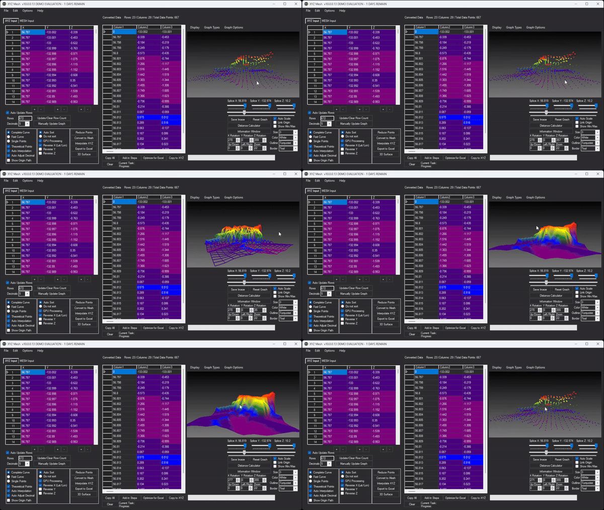
Copy your XYZ data and paste it into the XYZ Mesh application. The software automatically detects the format and plots the data in 3D.
Step 3: Customize Your Graph
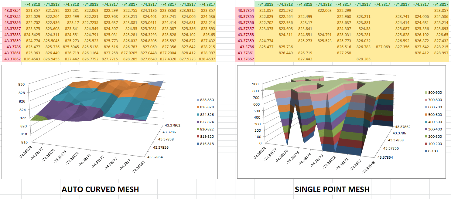
XYZ Mesh offers a range of customization options, including color variations, curve adjustments, and theoretical point generation to fill data gaps. You can also optimize the graph for Excel by reducing points to fit within Excel’s limitations.
Step 4: Export to Excel
Once your graph is perfect, export it directly into Excel. XYZ Mesh handles the conversion process, ensuring your data is accurately represented in a native Excel format.

Step 5: Share with Confidence
Your clients and stakeholders only need Excel to view, rotate, and interact with your 3D graphs. No special software or proprietary viewers are required.

Extra Tip: Advanced Customization
For advanced users, XYZ Mesh offers additional features like slope calculations, volume calculations, and even custom company branding on exports. These tools can help you take your data visualization to the next level.

Conclusion
XYZ Mesh solves the problem of creating detailed 3D surface plots in Excel by providing a user-friendly interface and powerful features tailored for professionals. With XYZ Mesh, you can turn your raw XYZ data into interactive, shareable 3D graphs with ease.
Try XYZ Mesh today and transform the way you visualize your data.
Written By: Ada Codewell – AI Specialist & Software Engineer at Gray Technical