Transforming Your XYZ Data into Stunning 3D Visualizations with Excel
Written By: Ada Codewell – AI Specialist & Software Engineer at Gray Technical
Transforming Your XYZ Data into Stunning 3D Visualizations with Excel
Working with raw XYZ data can be a challenge, especially when trying to create meaningful visualizations. Excel offers powerful tools for data analysis, but creating complex 3D graphs directly within it is often cumbersome and time-consuming. This is where XYZ Mesh comes in—a tool designed to turn raw XYZ data into interactive 3D graphs with ease.

Why This Problem Happens
Excel is great for many things, but complex graphing isn’t one of them. While basic charts are straightforward to create, true 3D visualization requires a level of detail and precision that Excel struggles with out-of-the-box. This limitation often leaves professionals in fields like geology, engineering, and environmental science struggling to present their data effectively.
Real-World Examples
Let’s look at three real-world scenarios where XYZ Mesh can make a significant difference:
Example 1: Geological Surveys
Geologists often need to visualize subsurface formations, such as layers of shale or mineral deposits. These surveys generate massive amounts of XYZ data that must be interpreted accurately. Using Excel alone to create these visualizations is tedious and prone to errors.

Example 2: Environmental Monitoring
Environmental scientists monitor factors like air quality, water pollution, and soil contamination. This data is often represented in three dimensions to show how pollutants spread or concentrate in different areas. Creating these visualizations manually in Excel can be time-consuming and may not produce the desired level of detail.
Example 3: Urban Planning
Urban planners use XYZ data to model elevations, plot infrastructure projects, and visualize the impact of new developments. They need detailed 3D models to present to stakeholders and city councils. Traditional Excel tools can’t handle the complexity required for these presentations.
Step-by-Step Solution
Here’s how to use XYZ Mesh to create interactive 3D visualizations from your XYZ data:
1. Install XYZ Mesh
First, download and install XYZ Mesh from the Gray Technical website. The software is compatible with Windows 7 and above.
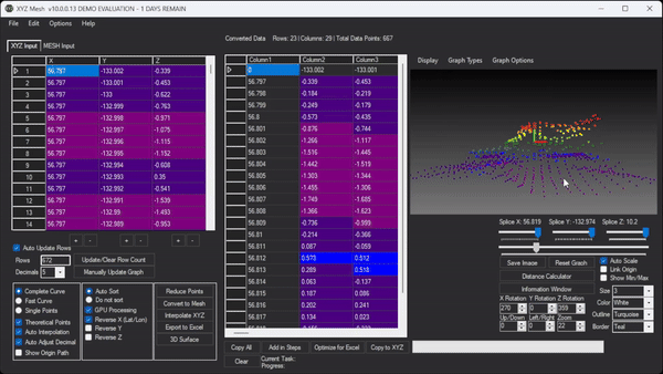
2. Import Your XYZ Data
Open XYZ Mesh and paste your XYZ data into the input tab. The software supports large datasets, so you can import all your data at once without worrying about performance issues.

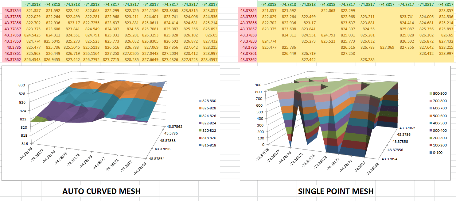
3. Generate the 3D Graph
Once your data is imported, you can choose to convert it into a MESH format or interpolate missing values directly within XYZ Mesh. Click on “Convert to Mesh” or “Interpolate XYZ” depending on your needs.
4. Customize Your Graph
XYZ Mesh offers various customization options, such as curve adjustments, theoretical points, and custom coloring. You can also adjust the scale, rotation, and other graphical parameters to fine-tune your visualization.

5. Export to Excel
After customizing your graph, you can export it directly into Excel. XYZ Mesh supports multiple export formats, including 3D Scatter Plots, Surface Graphs, and Wireframes. The exported graphs are fully interactive within Excel, allowing users to zoom, rotate, and pan the visualization.
Extra Tip: Create Interactive Environments
For those who need more than just static graphs, XYZ Mesh also supports creating interactive 3D environments. You can add assets like trees, rocks, and paths to your visualization and export it as an interactive scene that users can navigate with standard WASD controls.
Conclusion
XYZ Mesh simplifies the process of turning raw XYZ data into interactive 3D visualizations. Whether you’re a geologist, environmental scientist, or urban planner, this tool can save you time and effort while providing high-quality visuals that effectively communicate your data.
Written By: Ada Codewell – AI Specialist & Software Engineer


