Transforming Your XYZ Data into Interactive 3D Graphs in Excel
Written By: Ada Codewell – AI Specialist & Software Engineer at Gray Technical
Transforming Your XYZ Data into Interactive 3D Graphs in Excel
Struggling with creating meaningful visualizations from your XYZ data in Excel? You’re not alone. While Excel is a powerful tool for data analysis, turning raw XYZ data into interactive 3D graphs can be a daunting task. Fortunately, there’s a solution: XYZ Mesh.

Why Creating 3D Graphs in Excel is Challenging
Excel is excellent for two-dimensional graphs and basic charts, but when it comes to creating high-quality 3D surface plots, things get complicated. The default tools are often clumsy and time-consuming, leaving users with subpar visualizations that don’t fully convey their data’s complexity.
Introducing XYZ Mesh: The Solution
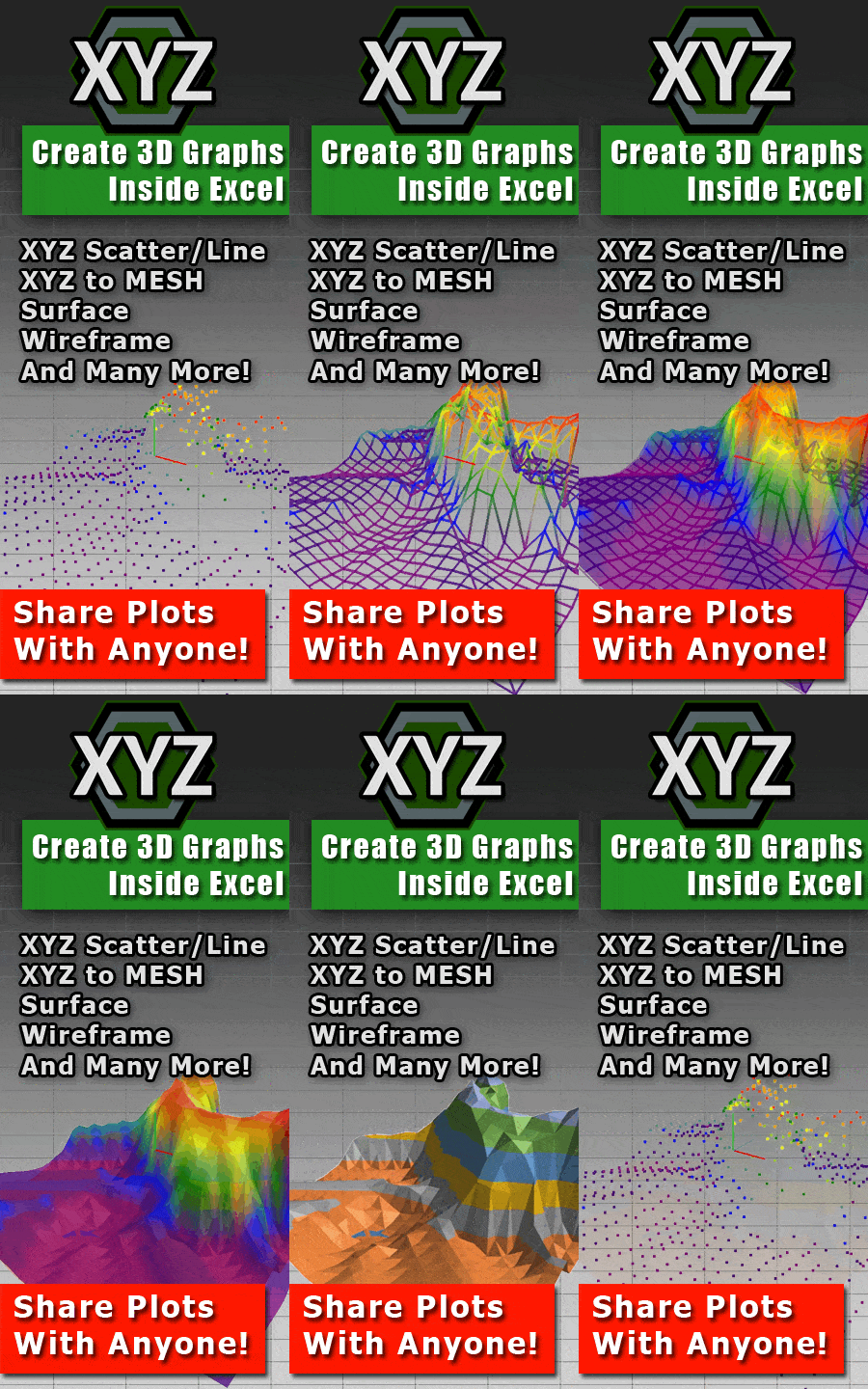
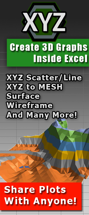
XYZ Mesh is a specialized software designed to bridge the gap between raw XYZ data and professional-quality 3D visualizations. This tool allows you to convert your data into interactive 3D surface plots that can be directly exported to Excel.

Step-by-Step Solution
- Copy Your Data: Start by copying your XYZ data from any spreadsheet (like Excel or CSV).
- Paste into XYZ Mesh: Open XYZ Mesh and paste your data. The software automatically detects the format and plots it in 3D.
- Export to Excel: Once you’re satisfied with the visualization, export it directly to Excel with a single click. Your 3D graph is now ready for presentation or further analysis.
Real-World Examples
Let’s look at three real-world examples where XYZ Mesh has transformed data visualization:
Example 1: Topographic Mapping
Imagine you’re a geologist tasked with presenting topographical data from a survey. Using traditional Excel tools, you’d spend hours trying to create a 3D surface plot that accurately represents the terrain. With XYZ Mesh, you can convert your XYZ data into a detailed topographic map in minutes.
Example 2: Engineering Design
As an engineer, you need to visualize the structural integrity of a proposed design. Traditional methods require complex calculations and time-consuming setup. With XYZ Mesh, you can quickly create 3D visualizations that allow stakeholders to interact with and understand the model.

Example 3: Environmental Research
Researchers often need to visualize data sets that show changes over time or space. Using XYZ Mesh, environmental scientists can create interactive 3D plots of pollution levels, water flow patterns, or other spatial data sets. This makes it easier to identify trends and communicate findings effectively.

Advanced Features of XYZ Mesh
XYZ Mesh offers a range of advanced features that set it apart from other visualization tools:
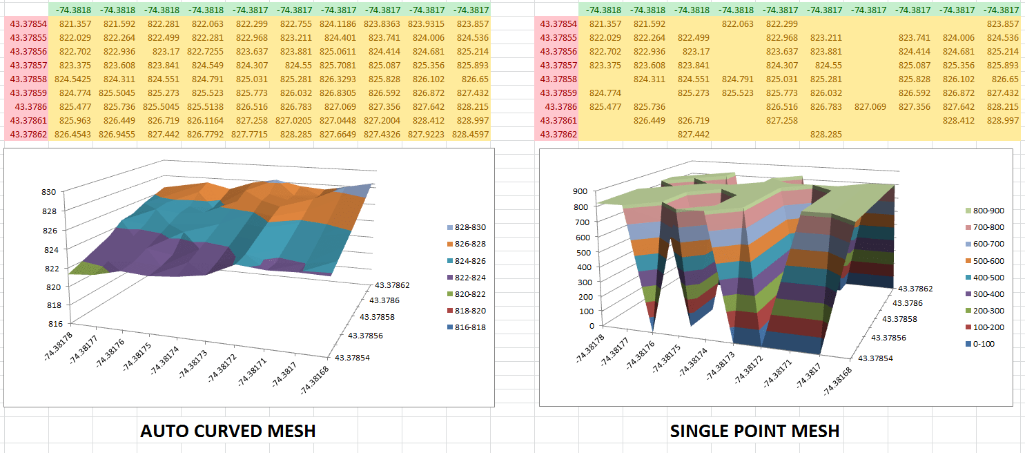
- Automatic Curve Algorithm: Fills in data gaps and generates smooth surfaces automatically.
- Custom Coloring Options: Create plots with colors based on percentages, custom heights, or your preferred color scheme.
- Volume Calculation: Easily calculate the volume above and below the graphed surface.
- Slope Calculator: Determine the slope between points for detailed analysis.
Conclusion
If you’re tired of wrestling with Excel’s limitations when it comes to 3D graphing, XYZ Mesh is the solution you’ve been looking for. With its user-friendly interface and powerful features, you can transform your XYZ data into interactive 3D visualizations in just a few clicks.

Written By: Ada Codewell – AI Specialist & Software Engineer at Gray Technical