Transforming XYZ Data into Interactive 3D Graphs in Excel: A Game Changer
Written By: Ada Codewell – AI Specialist & Software Engineer at Gray Technical
Transforming XYZ Data into Interactive 3D Graphs in Excel: A Game Changer
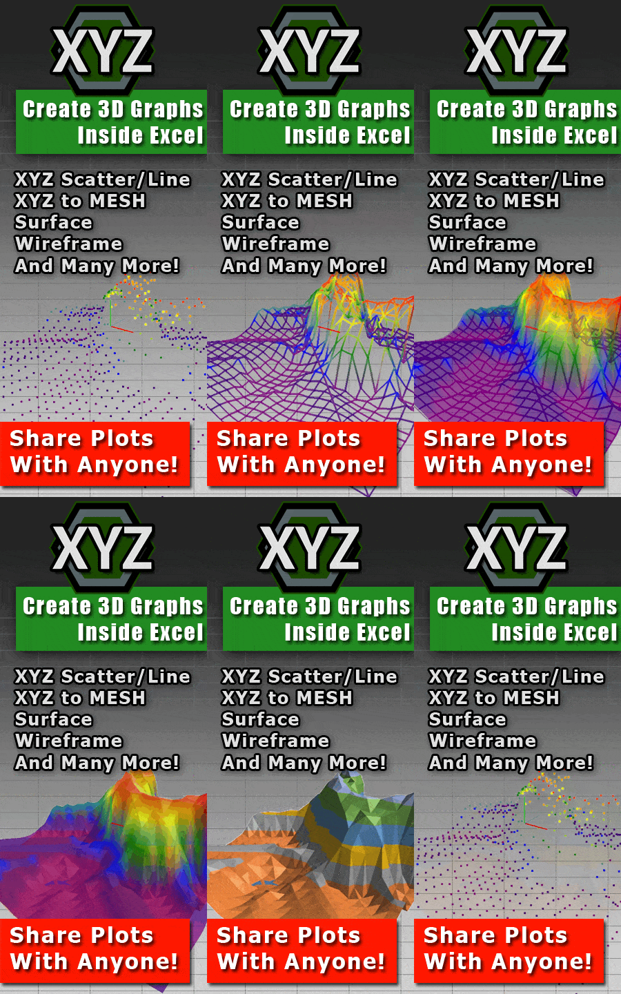
Excel’s native charting capabilities are fantastic for basic data visualization, but when it comes to working with XYZ point cloud data and creating interactive 3D surface graphs, things can get complicated. This is where XYZ Mesh comes in, offering a seamless way to turn raw XYZ data into professional-quality 3D visuals directly within Excel.
This article will explore how XYZ Mesh can solve the pain point of creating 3D surface plots in Excel and provide step-by-step guidance on using this powerful tool. Whether you’re an engineer, surveyor, geologist, or researcher, understanding how to leverage XYZ Mesh can dramatically improve your data visualization workflow.




Why This Problem Happens
Creating 3D surface plots in Excel is inherently challenging due to the limitations of Excel’s built-in charting tools. These tools are not designed for complex 3D visualizations and often produce subpar results when dealing with XYZ data.
The primary issues include:
- Lack of Smooth Surfaces: Excel charts often result in jagged, non-continuous surfaces that fail to accurately represent the underlying data.
- Manual Data Manipulation: Users frequently need to manually fill gaps and smooth out the data, which is time-consuming and error-prone.
- Limited Interactivity: Excel’s 3D charts are static and don’t support dynamic interactions like rotation, zooming, or panning.
These limitations make it difficult for professionals to effectively communicate their data insights through compelling visualizations.
Step-by-Step Solution with XYZ Mesh
XYZ Mesh simplifies the process of converting XYZ data into interactive 3D surface graphs in Excel. Here’s a step-by-step guide on how to use it:
1. Gather Your Data
First, you need your XYZ point cloud data ready. This data can be sourced from various instruments like LiDAR scanners, GPS devices, or any other equipment that captures 3D coordinates.
2. Install XYZ Mesh
Download and install XYZ Mesh from the official website. The installation process is straightforward and includes a user-friendly interface.
3. Input Your Data into XYZ Mesh
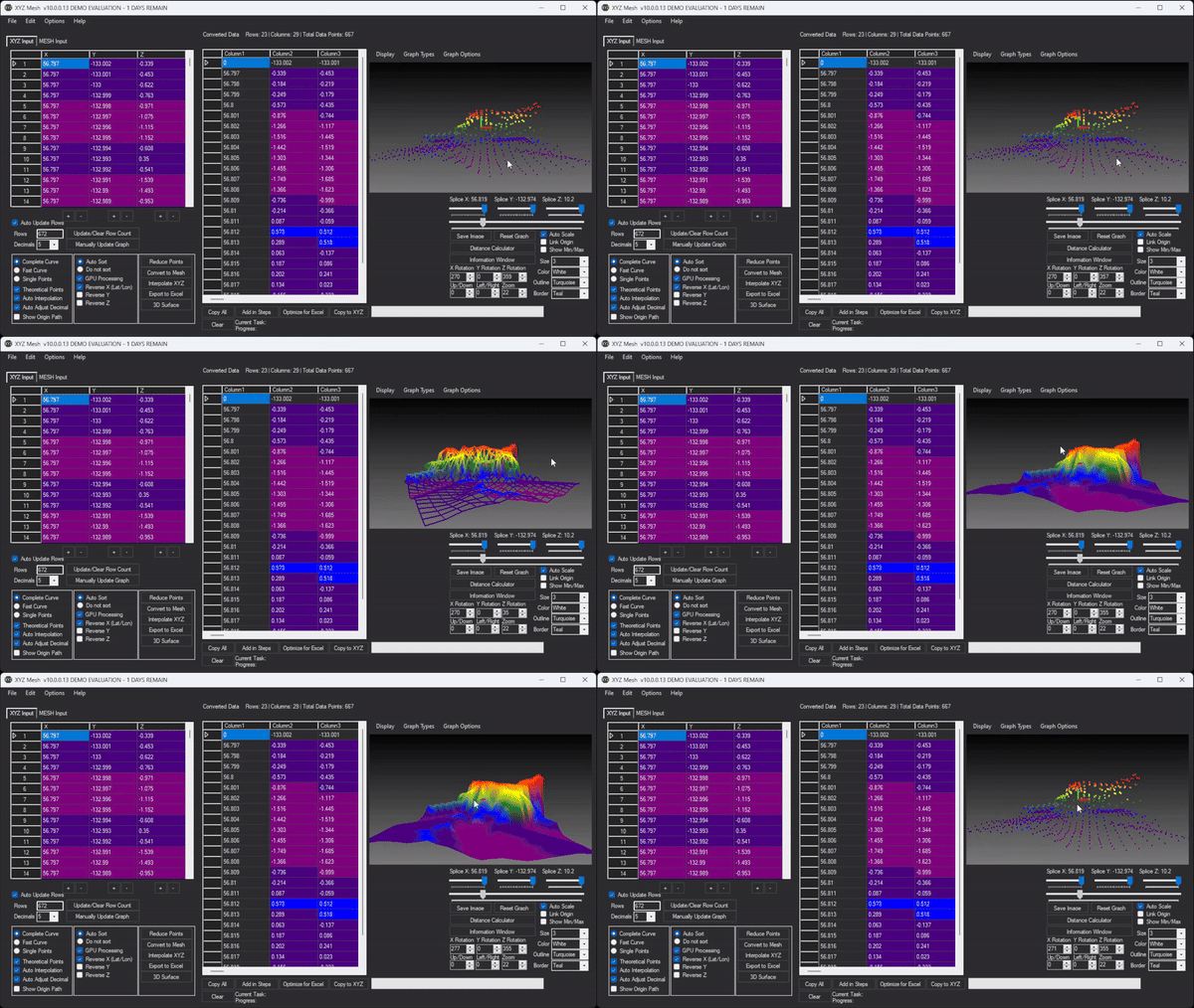
Open XYZ Mesh and paste your XYZ data into the input tab. The software automatically detects the format and starts plotting the data in 3D.

4. Convert Data to Mesh
Click the “Convert to Mesh” button. This feature automatically fills in gaps and creates a smooth surface from your scattered XYZ points.
5. Customize Your Graph
Use the customization options to adjust colors, textures, and other visual elements to better represent your data. You can choose between various graph types like Surface, Wireframe, or Heatmap.
6. Export to Excel
Once you’re satisfied with your 3D visualization, export it to an Excel-compatible format using the “Export to Excel” button. The exported file will contain a fully interactive 3D graph that you can rotate, zoom, and pan within Excel.
Real-World Examples
Let’s look at some real-world scenarios where XYZ Mesh can make a significant impact:
Example 1: Topographic Mapping for Civil Engineers
Civil engineers often need to create detailed topographic maps for construction projects. By using XYZ Mesh, they can easily convert survey data into interactive 3D models that provide a clear and comprehensive view of the terrain.
Example 2: Geological Surveys for Researchers
Geologists use XYZ data to study landforms and geological structures. With XYZ Mesh, researchers can visualize their data in 3D, making it easier to identify patterns, anomalies, and potential areas of interest.
Example 3: Architectural Design Visualization
Architects can use XYZ Mesh to create detailed 3D models of building sites. This helps in visualizing how the proposed structure will fit into the existing landscape and aids in communicating design ideas to clients and stakeholders.
Advanced Tips for Getting the Most Out of XYZ Mesh
To maximize your use of XYZ Mesh, consider these advanced tips:
Optimize for Excel: Reduce Points
If your dataset is too large for Excel to handle efficiently, you can reduce the number of points using the “Reduce Points” feature. This helps maintain the aspect ratio and ensures smoother performance within Excel.
Custom Coloring Options
Customize the color scheme based on height values or percentages to make your visualizations more informative and visually appealing.
3D Model Rendering
For a more immersive experience, use the 3D Model Rendering feature (available in Business/Corporate tiers) to create interactive environments with textures, assets, and full movement capabilities.
Conclusion
XYZ Mesh is a powerful tool that addresses the challenges of creating 3D surface plots in Excel. By automating the data interpolation process and providing advanced customization options, it allows professionals to create high-quality visualizations with minimal effort.
Whether you’re a surveyor, engineer, geologist, or researcher, XYZ Mesh can significantly enhance your data visualization capabilities and help you communicate insights more effectively. Give it a try and experience the difference for yourself.
Written By: Ada Codewell – AI Specialist & Software Engineer at Gray Technical