Transforming XYZ Data into Interactive 3D Graphs Directly in Excel
Written By: Ada Codewell – AI Specialist & Software Engineer at Gray Technical
Transforming XYZ Data into Interactive 3D Graphs Directly in Excel
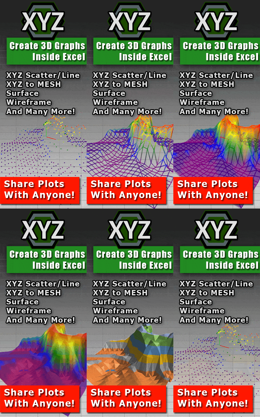
Have you ever struggled to visualize complex XYZ data in Microsoft Excel? The built-in charting tools just don’t cut it when you need to create detailed 3D surface graphs. That’s where XYZ Mesh comes in. This powerful software makes it easy to turn raw XYZ data into stunning, interactive 3D visualizations directly within Excel.
XYZ Mesh is the perfect solution for engineers, surveyors, geologists, and researchers who need to create professional-quality 3D graphs without dealing with proprietary formats or special viewers. With a simple copy-and-paste process, you can transform your data into interactive visuals that can be easily shared with colleagues, clients, or stakeholders.
This article will guide you through the process of using XYZ Mesh to solve one of the most common pain points in data visualization: creating accurate and interactive 3D surface graphs directly within Excel. We’ll explore why this is a challenge, provide real-world examples, and walk you through a step-by-step solution.




Why This Problem Happens
The problem with visualizing XYZ data in Excel is twofold. First, Excel’s built-in 3D charting tools are limited and often fail to produce accurate representations of complex datasets. Second, other specialized graphing software often exports data into proprietary formats that require specific viewers, making it difficult to share results with those who don’t have access to the same tools.
These challenges can be frustrating for professionals who need to communicate their findings effectively. Without the ability to create detailed, interactive 3D visualizations, it’s difficult to convey the nuances of your data clearly and convincingly.
Step-by-Step Solution with XYZ Mesh
XYZ Mesh solves these problems by converting XYZ data into professional-quality 3D visuals that can be directly integrated into Excel. Here’s how you can use it to create stunning 3D surface graphs:
Step 1: Prepare Your Data
Start by collecting your XYZ data. This could be from a survey, experiment, or any other source that provides point cloud data.
For example, let’s say you have a dataset of topographical points collected from a land survey:
X  Y  Z
0  0  10
1  0  12
0  1  8
1  1  9
Copy this data to your clipboard.
Step 2: Paste Data into XYZ Mesh
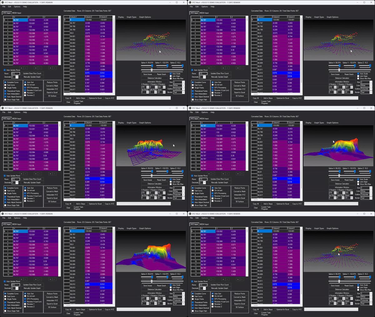
Open XYZ Mesh and paste your data into the input window. The software will automatically detect the format and begin plotting the points in 3D.

Step 3: Convert to Mesh
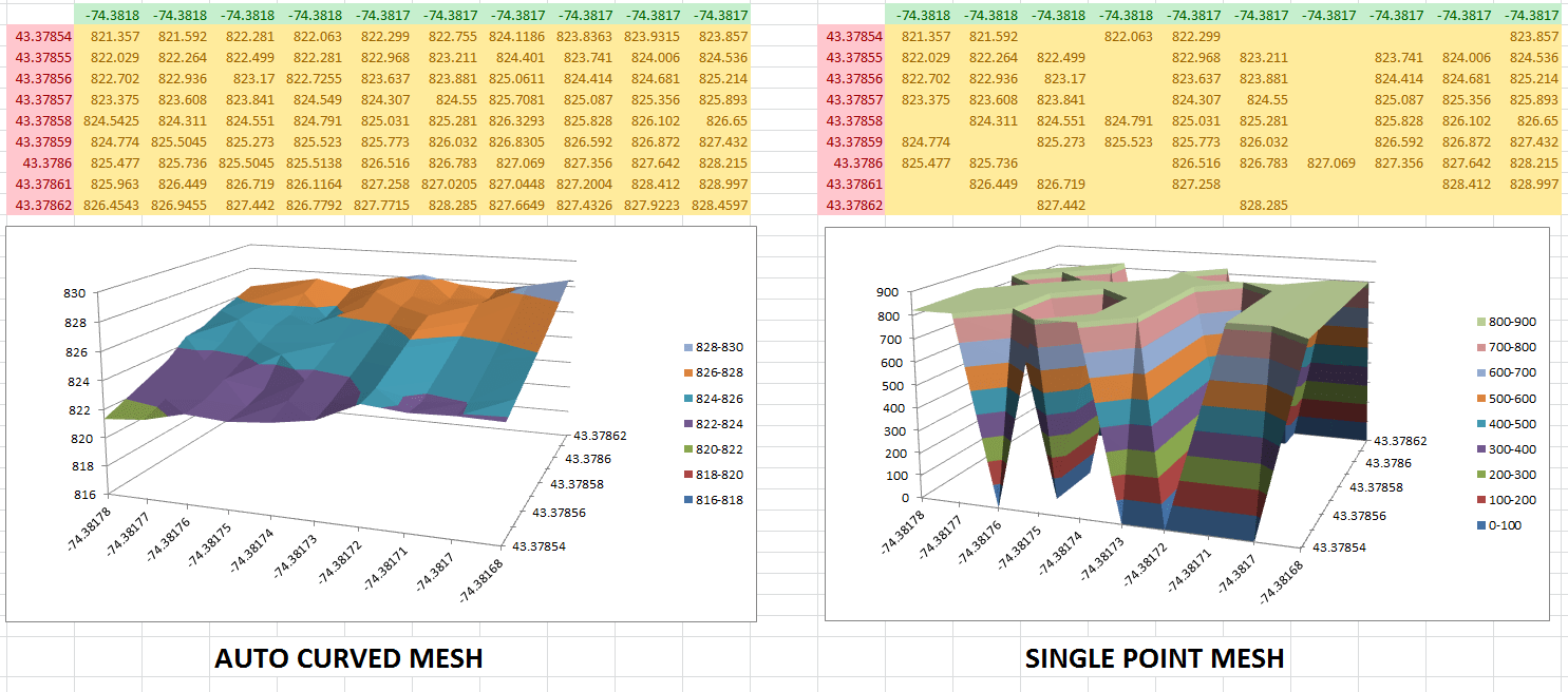
To create a smooth surface graph, you need to convert your XYZ data into a mesh format. Click the “Convert to Mesh” button in XYZ Mesh. The software will automatically fill in any gaps in your data and generate a smooth surface.
Step 4: Export to Excel
Once your data is converted, you can export it directly into Excel by clicking the “Export to Excel” button. XYZ Mesh will create a new Excel file with an interactive 3D surface graph embedded within it.

Step 5: Share Your Visualization
Now that your data is in Excel, you can share it with anyone who has access to Microsoft Excel. They’ll be able to interact with the 3D graph, rotate it, zoom in and out, and get a clear understanding of your data.
Real-World Examples
Here are three real-world scenarios where XYZ Mesh can make a significant difference:
Example 1: Topographical Surveying
Surveyors often need to visualize terrain data for construction projects. With XYZ Mesh, they can create detailed 3D surface graphs that show elevation changes, slopes, and other important features.
Example 2: Geological Studies
Geologists use point cloud data to study rock formations and underground structures. XYZ Mesh allows them to create interactive 3D models that can be analyzed from any angle.
Example 3: Engineering Design
Engineers working on infrastructure projects can use XYZ Mesh to visualize structural data. This helps in identifying potential issues and ensuring that designs meet safety standards.
Extra Tip: Customizing Your Graph
XYZ Mesh offers a variety of customization options to enhance your visualizations. You can adjust colors, add textures, and even create interactive 3D environments with assets like trees and rocks.
For example, you can use the “Custom Coloring Options” feature to color your graph based on height values or percentages. This can help highlight important data points and make your visualizations more informative.
Conclusion
XYZ Mesh is a game-changer for anyone who needs to visualize XYZ data in Excel. It eliminates the need for specialized viewers and proprietary formats, making it easy to share interactive 3D graphs with colleagues and clients. With just a few clicks, you can transform your raw data into professional-quality visualizations that help you communicate your findings more effectively.
Ready to take your data visualization to the next level? Try XYZ Mesh today and experience the difference for yourself.
Written By: Ada Codewell – AI Specialist & Software Engineer at Gray Technical