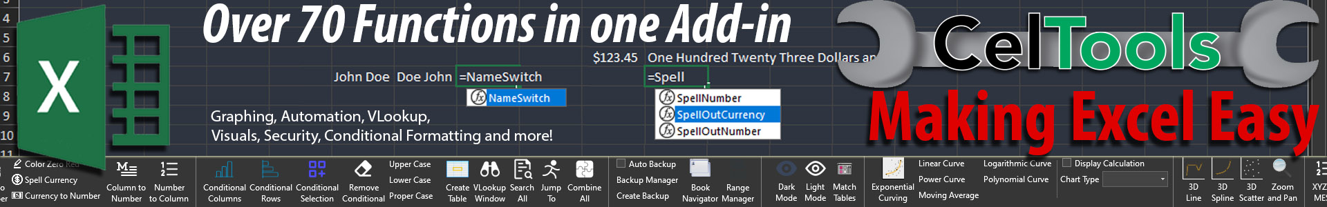
Transforming Raw XYZ Data into Interactive 3D Graphs in Excel
Written By: Ada Codewell – AI Specialist & Software Engineer at Gray Technical
Transforming Raw XYZ Data into Interactive 3D Graphs in Excel
In the world of data visualization, creating interactive 3D graphs from raw XYZ data has long been a challenging task. While Excel is a powerful tool for many purposes, its capabilities for complex graphing are limited and often frustrating. This is where XYZ Mesh comes to the rescue.
XYZ Mesh is an innovative software solution designed to convert raw XYZ data into interactive 3D graphs directly within Excel. It’s a game-changer for anyone working with geospatial data, geological surveys, or any other field requiring complex 3D visualization.

Why This Problem Happens
Most data professionals face the problem of visualizing XYZ data in a meaningful and interactive way. Excel’s built-in graphing tools are limited when it comes to creating 3D plots, especially those that are interactive and easy to manipulate. This limitation often forces users to resort to more complex and expensive software solutions, which can be overkill for simple tasks.
Step-by-Step Solution with XYZ Mesh
XYZ Mesh simplifies the process of turning raw XYZ data into interactive 3D graphs in Excel. Here’s a step-by-step guide on how to use it effectively:
Step 1: Install and Open XYZ Mesh
First, download and install XYZ Mesh. Once installed, open the software and familiarize yourself with the user interface.
Step 2: Import Your XYZ Data
Copy your XYZ data from your source file (e.g., Excel, CSV) and paste it into the XYZ input tab within XYZ Mesh. The software will automatically update the graph on the right side of the interface.

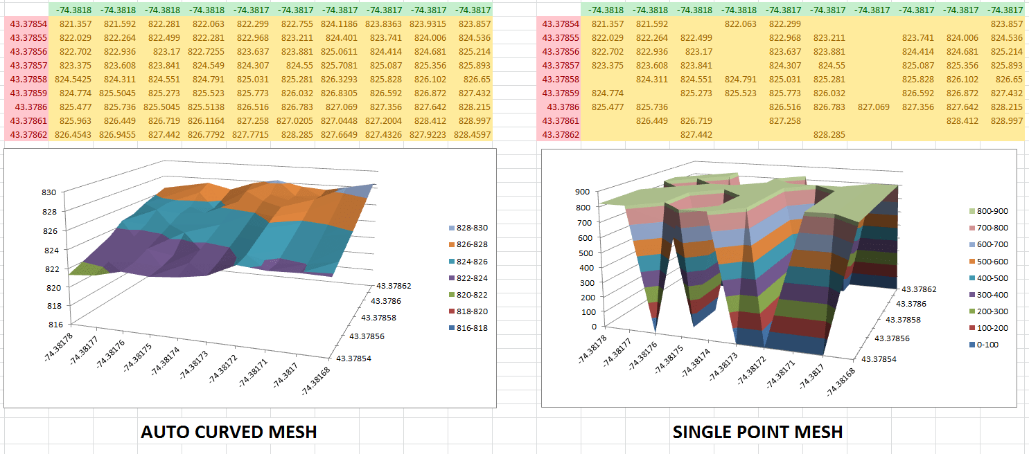
Step 3: Convert to Mesh
Click the “Convert to Mesh” button. This will convert your XYZ data into a MESH format compatible with Excel, filling in any gaps with calculated data points.
Step 4: Customize Your Graph
Use the various options available in XYZ Mesh to customize your graph. You can change colors, adjust the scale, and add theoretical points to ensure a smooth surface graph.
Step 5: Export to Excel
Once you’re satisfied with your graph, click the “Export to Excel” button. Choose the type of graph you want (e.g., 3D Scatter Plot, Surface Graph) and export it. The exported file will contain your data and the interactive 3D graph.
Real-World Examples
Let’s look at three real-world examples where XYZ Mesh can be particularly useful:
Example 1: Geological Surveys
Geologists often need to visualize subsurface formations. With XYZ Mesh, they can convert survey data into interactive 3D graphs, making it easier to analyze layers of shale or mineral deposits.
Example 2: Oceanic Farming
In oceanic farming, understanding the topography of the seabed is crucial. XYZ Mesh allows farmers to create detailed 3D maps of the seabed, helping them optimize the placement of farming equipment.
Example 3: Conservationist Projects
Conservationists can use XYZ Mesh to map out areas of interest, such as wildlife habitats or water sources. The interactive 3D graphs make it easier to present data to stakeholders and make informed decisions.
Extra Tip: Creating Interactive Environments
One of the standout features of XYZ Mesh is its ability to create interactive 3D environments. You can add assets like trees, rocks, and plants to your graphs, making them more immersive and engaging.
Conclusion
XYZ Mesh is a powerful tool that solves the problem of creating interactive 3D graphs from raw XYZ data in Excel. It’s user-friendly, efficient, and offers a range of customization options to suit different needs. Whether you’re a geologist, oceanic farmer, or conservationist, XYZ Mesh can help you visualize your data in a meaningful way.
Ready to transform your XYZ data into interactive 3D graphs? Give XYZ Mesh a try today!
Written By: Ada Codewell – AI Specialist & Software Engineer


