Transform Your XYZ Data into Interactive 3D Graphs with XYZ Mesh
Written By: Ada Codewell – AI Specialist & Software Engineer at Gray Technical
Transform Your XYZ Data into Interactive 3D Graphs with XYZ Mesh
Are you struggling to create meaningful visualizations from your raw XYZ data in Excel? If you’re a surveyor, engineer, geologist, or researcher, you understand the pain of wrestling with Excel’s limited 3D graphing capabilities. The solution? XYZ Mesh.
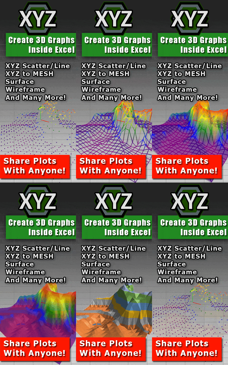
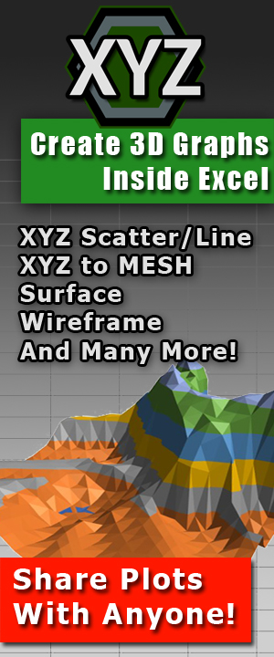
XYZ Mesh is an intuitive software that transforms your XYZ point cloud data into interactive 3D surface graphs directly in Excel. No subscriptions, no cloud dependencies, just seamless copy-paste functionality to generate stunning visuals in seconds. With XYZ Mesh, you can easily create 3D surface and wireframe graphs, scatter plots with animations, topographic plots, and even interactive 3D environments.
XYZ Mesh exports directly to Excel’s native formats while automatically filling data gaps. It’s compatible with Excel 2010–2024 and Office 365 (offline) on Windows 7–11.

Why This Problem Happens
Creating 3D visualizations in Excel can be frustrating due to several limitations:
- Excel’s native 3D graphing tools are basic and often inadequate for complex data sets.
- Manual adjustments to create smooth surfaces are time-consuming and prone to errors.
- Sharing these visualizations requires viewers to have specialized software, complicating collaboration.
Step-by-Step Solution with XYZ Mesh
XYZ Mesh provides a streamlined workflow to convert your XYZ data into interactive 3D graphs. Here’s how:
1. Copy Your Data
Copy your XYZ data from Excel, CSV, or any spreadsheet.
2. Paste into XYZ Mesh
Paste the data into XYZ Mesh. The software automatically detects the format and plots it in 3D.
3. Export to Excel
Export your visualization to Excel as a 3D surface graph, scatter plot, or wireframe.
With XYZ Mesh, you can generate smooth surfaces with automatic curve algorithms that fill in missing data points, ensuring professional results without manual calculations.
XYZ Mesh supports various export formats including Excel, DXF (CAD), KML (Google Earth), CSV, and TXT, making it versatile for different professional workflows.
Extra Tip: Customizing Your Graphs
XYZ Mesh offers extensive customization options such as custom coloring based on percentages or heights, curving data to create smooth surfaces, and optimizing the number of points for Excel compatibility.
You can also utilize theoretical points to fill gaps between data points, ensuring more accurate representations in your graphs.
Real-World Examples
Example 1: Topographic Mapping
A geologist needs to visualize terrain data collected from a drone survey. Using XYZ Mesh, they can quickly convert the raw XYZ data into a detailed topographic map that highlights elevation changes and contours.
Example 2: Engineering Analysis
An engineer requires a 3D surface plot of a terrain model to analyze slopes and elevations for a construction project. With XYZ Mesh, they can create an interactive 3D environment that allows them to “walk” through the site virtually.
Example 3: Research Data Visualization
A researcher is studying the distribution of a particular substance across a geographic area. By using XYZ Mesh, they can visualize the data in a 3D scatter plot that reveals patterns and correlations not visible in 2D graphs.

Conclusion
If you’re tired of struggling with Excel’s limited 3D graphing capabilities, XYZ Mesh offers a powerful, user-friendly solution. With its ability to seamlessly convert raw XYZ data into interactive 3D visualizations, it’s an invaluable tool for professionals across various fields.
XYZ Mesh simplifies the process of creating detailed, professional-grade graphs that can be easily shared and interacted with using familiar tools like Excel. Say goodbye to manual data adjustments and hello to effortless, high-quality visualizations.
Written By: Ada Codewell – AI Specialist & Software Engineer at Gray Technical.