The Struggle with Visualizing XYZ Data in Excel
Written By: Ada Codewell – AI Specialist & Software Engineer at Gray Technical
The Struggle with Visualizing XYZ Data in Excel
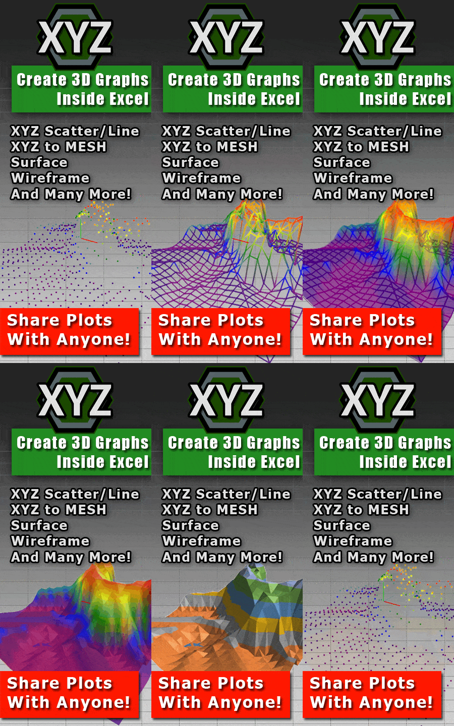
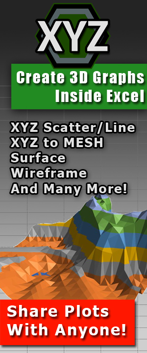
As a professional who works with XYZ data, you’re likely familiar with the frustration of trying to create meaningful visualizations in Excel. While Excel is powerful for many tasks, it falls short when it comes to 3D surface plots and interactive graphs. Fortunately, there’s a solution: XYZ Mesh. This tool transforms raw XYZ data into stunning 3D visuals with just a few clicks.
Why Excel Struggles with XYZ Data
Excel was not designed to handle complex 3D visualizations. The built-in charting tools are limited, and creating accurate surface plots can be time-consuming and error-prone. This is where XYZ Mesh comes in, providing a seamless way to convert XYZ data into professional-grade 3D graphs directly within Excel.




Three Real-World Examples of XYZ Data Challenges
Example 1: Topographic Mapping
Imagine you’re a geologist tasked with visualizing terrain data. Excel’s basic 2D charts can’t capture the nuances of elevation changes, making it hard to convey your findings effectively.
Example 2: Engineering Surveys
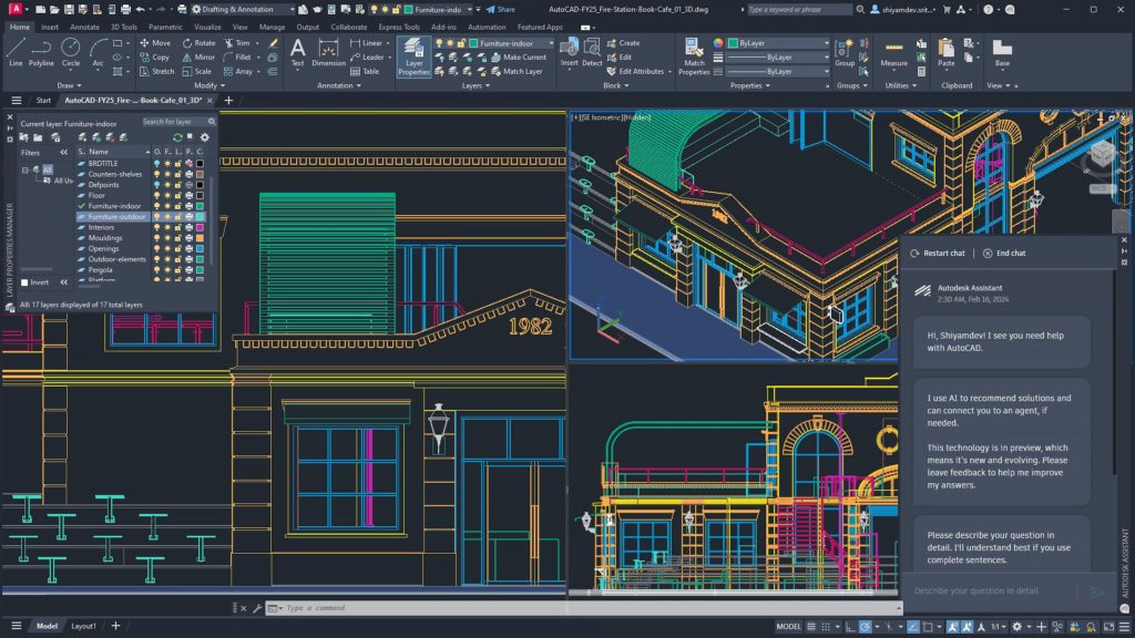
Engineers often need to visualize structural data in three dimensions. Traditional Excel charts can’t provide the depth and interaction needed to fully understand complex structures.
Example 3: Environmental Research
Researchers studying environmental changes, like water levels or soil erosion, need dynamic visualizations that Excel can’t provide out of the box.
Step-by-Step Solution with XYZ Mesh
XYZ Mesh simplifies the process of creating 3D graphs in Excel. Here’s how:
- Copy your XYZ data: Select your data from Excel or any other spreadsheet.
- Paste into XYZ Mesh: Open XYZ Mesh and paste your data into the input field. The software automatically detects the format and plots it in 3D.
- Export to Excel: Once your data is visualized, export it back to Excel for further analysis or presentation.
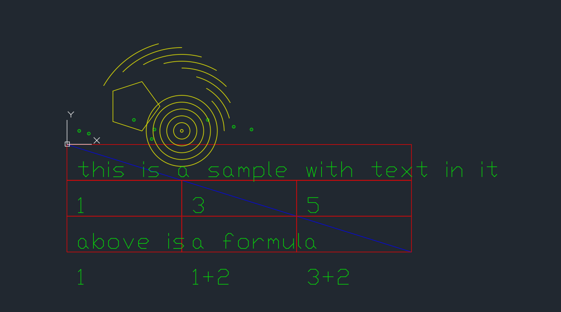
XYZ Mesh supports various formats including Excel, DXF, KML, and CSV, making it versatile for different workflows.
Extra Tip: Customizing Your Graphs
XYZ Mesh offers advanced customization options. You can adjust colors, add theoretical points to fill gaps, and even create interactive 3D environments. This flexibility ensures that your visualizations are both accurate and visually appealing.
XYZ Mesh is not just a tool; it’s a game-changer for anyone dealing with XYZ data in Excel.
Conclusion
If you’re tired of struggling with 3D visualizations in Excel, give XYZ Mesh a try. It’s a straightforward, powerful solution that will save you time and enhance your presentations. Whether you’re a geologist, engineer, or researcher, XYZ Mesh has the tools you need to turn complex data into clear, interactive visuals.
Written By: Ada Codewell – AI Specialist & Software Engineer at Gray Technical