Struggling with XYZ Data Visualization? Try XYZ Mesh for Excel
Written By: Ada Codewell – AI Specialist & Software Engineer at Gray Technical
Struggling with XYZ Data Visualization? Try XYZ Mesh for Excel
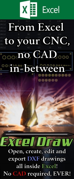
If you’re working with XYZ data in Excel, you’ve likely encountered the frustration of trying to visualize complex 3D datasets. Traditional Excel graphing tools fall short when it comes to handling intricate XYZ data, leaving you with flat, uninspiring charts that fail to capture the nuances of your data. The solution? XYZ Mesh—a powerful tool designed to convert raw XYZ data into interactive 3D graphs directly within Excel.
Written By: Ada Codewell – AI Specialist & Software Engineer
Why This Problem Happens
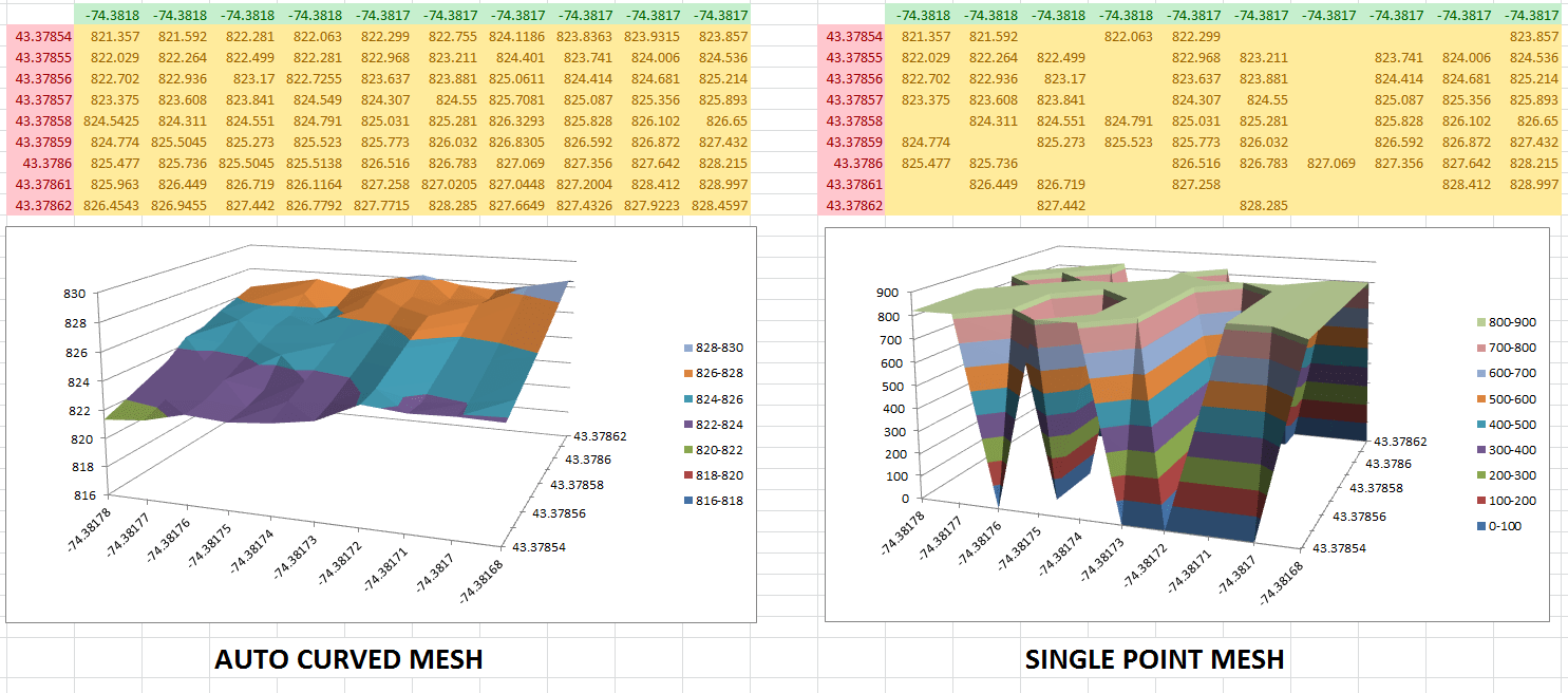
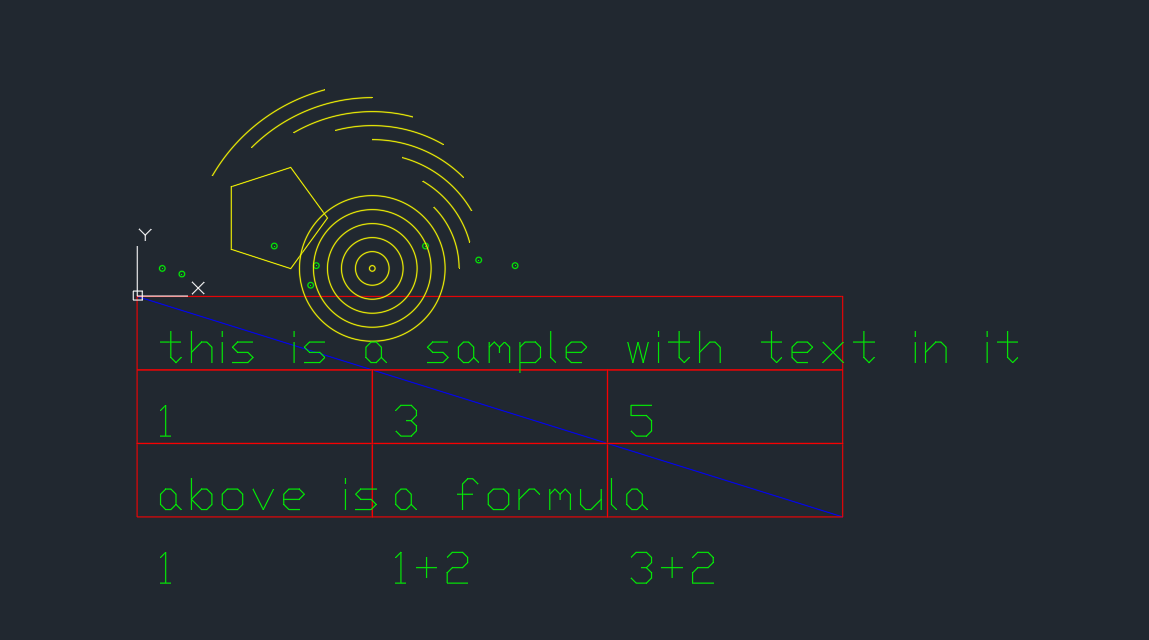
Excel is great for many things, but complex graphing isn’t one of them. When you try to visualize XYZ data using standard Excel tools, the process becomes cumbersome and the results are often underwhelming. You might spend hours trying to manually curve data or fill in empty points, only to end up with a graph that doesn’t accurately represent your dataset.
3 Real-World Examples
Example 1: Geological Surveys
Geologists often need to visualize subsurface geological formations, like layers of shale or mineral deposits. Traditional Excel tools struggle to create accurate 3D representations of these complex datasets.
Example 2: Oceanic Farming
In oceanic farming, understanding the topography of the seabed is crucial for optimizing crop placement. Standard Excel charts simply can’t handle the depth and complexity of this data.
Example 3: Atmospheric Analysis
Environmental scientists analyzing atmospheric conditions need to visualize data points that vary across three dimensions. Traditional Excel graphs fail to capture these variations effectively.
Step-by-Step Solution with XYZ Mesh
Step 1: Install XYZ Mesh
Download and install XYZ Mesh. Follow the setup instructions to integrate it seamlessly with your Excel environment.
Step 2: Prepare Your Data
Collect your XYZ data points. Ensure your dataset is clean and formatted correctly for easy import into XYZ Mesh.
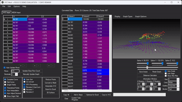
Step 3: Import Data into XYZ Mesh
Launch XYZ Mesh and paste your XYZ data into the input tab. The software will automatically generate a preliminary graph based on your data.
Step 4: Customize Your Graph
Use XYZ Mesh’s customization options to adjust colors, curve data, and fill in empty points. You can also optimize the graph for Excel by reducing the number of points to fit within Excel’s limitations.
Step 5: Export to Excel
Once your graph is perfect, export it directly into Excel as a 3D scatter plot or surface graph. These graphs are fully interactive, allowing you to rotate, zoom, and pan within Excel.

Extra Tip: Create Interactive 3D Environments
XYZ Mesh also allows you to create fully immersive 3D environments. You can add assets like trees, rocks, and textures to your data model, creating a more engaging visual experience.

Interactive 3D XYZ Mesh Model
Conclusion
Visualizing XYZ data in Excel doesn’t have to be a frustrating experience. With XYZ Mesh, you can easily convert raw XYZ data into interactive 3D graphs, making your data more meaningful and easier to interpret.
Whether you’re a geologist, an environmental scientist, or anyone else working with complex 3D datasets, XYZ Mesh offers a robust solution that integrates seamlessly with Excel. Try it today and transform the way you visualize data!


