How to Transform XYZ Data into Stunning Interactive Graphs in Excel
Written By: Ada Codewell – AI Specialist & Software Engineer at Gray Technical

How to Transform XYZ Data into Stunning Interactive Graphs in Excel
Are you struggling with turning your raw X Y Z data into professional-quality visualizations within Microsoft Excel? If the built-in tools aren’t giving you the results, it might be time for a smarter solution: introducing XYZ Mesh, which guarantees an effortless way to graph XYZ data inside of Excel.
Why is Creating 3D Graphs in Excel So Challenging?
The primary issue lies with the inherent limitations and complexities involved in creating high-quality, interactive 3D graphs using standard spreadsheet tools. While basic charting functions are available within Microsoft Excel, they fall short when it comes to generating detailed XYZ scatter plots or surface meshes.
Why People Struggle With This Problem
The limitations of built-in graphing functionalities can lead to several specific challenges:
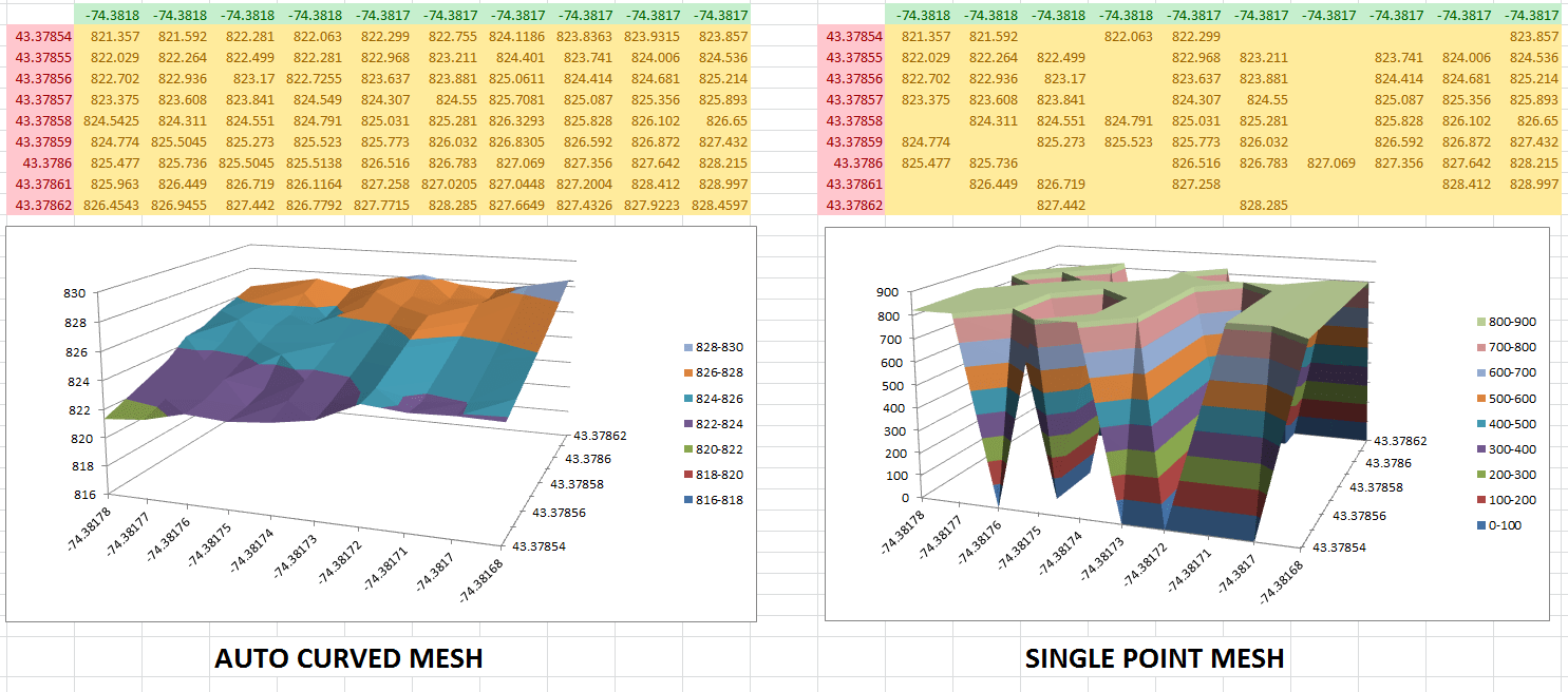
- Data Gaps and Inaccuracies: If your dataset has missing points, Excel’s default tools won’t accurately fill in the gaps.
- Complexity of Manipulating 3D Data: Creating detailed visualizations often requires complex calculations that native spreadsheet software isn’t designed to handle efficiently.
The Step-by-Step Solution Using XYZ Mesh
Here’s a comprehensive guide on how you can leverage XYZ Mesh for turning your raw data into interactive 3D graphs:
- Step 1: Obtain and Install XYZ Mesh.
- Step 2: Prepare Your Data. Ensure your X, Y, Z data is correctly formatted in an Excel sheet. You can import it directly from a CSV file or manually input the values:
|   X    |     Y       |      Z        |

|----------|-------------|----------------|

| 1.023456| -987.123456 | 345.654321|
- Step 3: Input Data into XYZ Mesh.
Open the software, select “Copy Converted Data to Clipboard” from your Excel sheet and paste it into XYZ Mesh. The application will automatically update graph views:
- Step 4: Customize Your Visualization.
In XYZ Mesh, you have several options to customize the appearance of your graph:
- Custom color schemes based on height or percentage ranges
- Theoretically calculated data points for filling gaps in datasets
- “Curve and Fill” option that uses algorithms to complete curves where necessary.
- Step 5: Export Your Data Back into Excel. Once satisfied with your graph, use the “Export” function within XYZ Mesh. You can choose between various formats like Scatter Plot or Surface Graph:

- Step 6: Integrate Your Data for Presentation.
Once exported, integrate your graphs directly into your Excel presentations with interactive features such as rotations and zooms. You can share these files confidently knowing that anyone using standard Excel software will be able to interactively view them.
Extra Tip:
Advanced users might want to create paraboloids or complex multi-layered graphs for in-depth analysis.
### Conclusion and Next Steps
Transforming your XYZ data into interactive, high-quality visualizations has never been easier with XYZ Mesh. With its powerful features for curve completion, theoretical point calculation, and intuitive export capabilities to Excel formats that guarantee seamless sharing across different users, it addresses the fundamental pain points of 3D data visualization within Microsoft Office environments.
Explore XYZ Mesh today to experience a more efficient and professional way of presenting your XYZ datasets.


