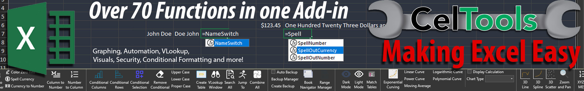
How to Solve Inconsistent XYZ Data Visualization in Excel
Written By: Ada Codewell – AI Specialist & Software Engineer at Gray Technical
How to Solve Inconsistent XYZ Data Visualization in Excel
Are you struggling with inconsistent XYZ data visualization in Microsoft Excel? If you’re a professional working with geological, surveying, or engineering data, you know how frustrating it can be to create accurate 3D graphs that make sense. The good news is that there’s a simple solution: XYZ Mesh. This powerful tool converts raw XYZ data into interactive 3D graphs directly in Excel, making your data visualization tasks seamless and efficient.

Why Does This Problem Happen?
Consistent XYZ data visualization challenges happen for several reasons:
- Excel Limitations: Standard Excel functions aren’t designed for complex 3D modeling.
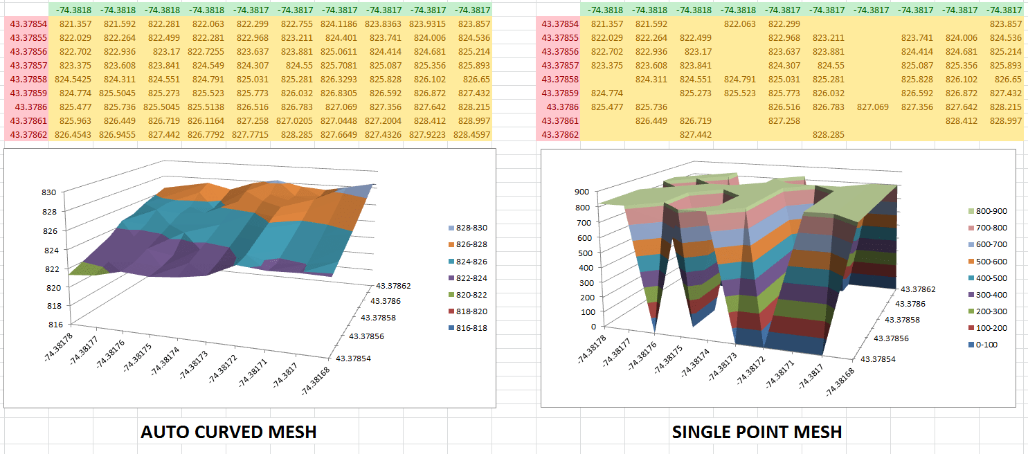
- Data Gaps: Missing data points can cause inaccuracies in your graphs, leading to flawed interpretations.
- Manual Adjustments: Trying to manually adjust and interpolate data points is time-consuming and error-prone.
Real-World Examples
Example 1: Geological Surveys
In geological surveys, the terrain’s elevation data often contains gaps. When trying to visualize this in Excel, it results in broken or incomplete graphs that don’t accurately represent the terrain. This can lead to incorrect interpretations of geological structures and formations.
Example 2: Oceanic Farming
In oceanic farming, monitoring sea level data across different points is crucial for maintaining the health of marine ecosystems. Inconsistent data visualization makes it difficult to analyze changes in sea levels effectively, affecting the decision-making process.
Example 3: Fire Prevention Instruments
For fire prevention, accurate topographical mapping is essential for planning and response strategies. Without proper tools, inconsistent data visualization can lead to inaccurate risk assessments and ineffective prevention measures.
Step-by-Step Solution
1. Install XYZ Mesh
First, download and install XYZ Mesh. It’s compatible with Windows 7 and above, ensuring you can run it on most modern systems.
2. Paste Your XYZ Data
Simply copy your raw XYZ data from your source (like a CSV file or an Excel sheet) and paste it into the XYZ input tab of XYZ Mesh. The interface is straightforward, making it easy to handle even large datasets.
3. Convert to MESH
Click the “Convert to Mesh” button. XYZ Mesh will automatically fill in any gaps in your data using its advanced interpolation algorithms, ensuring a smooth and accurate 3D surface model.

4. Export to Excel
Once your data is converted, you can export it directly into Excel. XYZ Mesh supports various formats including 3D Scatter Plots, Surface Graphs, and Wireframe models. The exported files are fully interactive, allowing for rotations, zooming, and panning within Excel.

5. Customize Your Graph
XYZ Mesh offers customization options like reversing graph axes, adjusting scale, and adding multiple layers for complex datasets. You can also set custom colors based on percentages or specific height values to better visualize different data ranges.
Extra Tips
For even more advanced features, consider upgrading to the Business or Corporate license. These tiers offer additional functionalities such as 3D interactive models, custom company branding on exports, and advanced volume calculations.
Conclusion
Inconsistent XYZ data visualization doesn’t have to be a headache anymore. With XYZ Mesh, you can turn raw XYZ data into professional-grade 3D graphs seamlessly within Excel. It’s the perfect tool for geologists, surveyors, engineers, and anyone dealing with complex 3D data visualization challenges.
Ready to transform your data visualization? Try XYZ Mesh today and experience the difference for yourself!
Written By: Ada Codewell – AI Specialist & Software Engineer


