How to Create Dynamic Excel Dashboards with PivotTables
How to Create Dynamic Excel Dashboards with PivotTables

Written By: Ada Codewell – AI Specialist & Software Engineer at Gray Technical
The Challenge of Creating Dynamic Excel Dashboards
Creating dynamic dashboards in Excel can be a daunting task, especially for those who are new to PivotTables. The complexity often lies not just in understanding how to create the tables but also in making them interactive and visually appealing.
The Problem with Static Reports
Static reports lack flexibility. They don’t allow users to interact with data or explore different scenarios on their own, which can be a significant limitation for decision-makers who need real-time insights.

The Power of PivotTables in Excel Dashboards
PivotTables are one of the most powerful tools available in Excel. They allow you to summarize, analyze, explore and present your data quickly and efficiently.
Why People Struggle with Dynamic Reports
- Complexity: Setting up PivotTables can be complex for beginners who are not familiar with the interface or functionality of Excel’s analytical tools.
- Data Preparation: Often, data needs to be cleaned and properly formatted before it can be used in a PivotTable. This step alone can deter many users from creating dynamic reports.
A Step-by-Step Guide to Creating Dynamic Excel Dashboards with PivotTables
Step 1: Prepare Your Data for Analysis
The first and most crucial step in building a dashboard is preparing your data. This involves cleaning up any inconsistencies, ensuring all necessary columns are present, and organizing the data into rows.
A | B
-------
Name    Age
John     25
Jane     30
Step 2: Create Your PivotTable
Once your data is prepared, you can create a PivotTable. Select the range of cells that contain your data and go to Insert > PivotTable.

Step 3: Design Your Dashboard Layout
The layout of your dashboard is crucial for usability. Use slicers and filters to make the data interactive.
=SUMIFS(B2:B10, A2:A10, "John")Using Slicers in PivotTables
To add a slicer:
- Click on your PivotTable.
- Go to Analyze > Insert Slicer.
- Select the fields you want to filter by and click OK.
Step 4: Add Visual Elements with Charts
Charts are essential for visualizing data. You can create various types of charts like bar graphs, pie charts, or line graphs based on your PivotTable data.
=AVERAGE(B2:B10)Creating a Chart from Your Data
To add a chart:
- Select the range of cells with your data.
- Go to Insert > Charts and choose the type you want (e.g., Bar, Line).
The Advanced Technique: Using VBA for Automation
For those who need even more automation in their dashboards, using Visual Basic for Applications (VBA) can be a game-changer. Here’s an example of how to create a PivotTable with VBA:
Sub CreatePivotTable()
    Dim ws As Worksheet
    Set ws = ThisWorkbook.Sheets("Sheet1")

    ' Define the data range for your pivot table.
    Dim pvtRange As Range
    Set pvtRange = ws.Range("A2:B6")  ' Adjust this to match your actual data.

    ' Create a new worksheet for the PivotTable report.
    Worksheets.Add.Name = "PivotSheet"

    ' Define where you want the pivot table placed on that sheet.
    Dim pvtDestination As Range
    Set pvtDestination = ThisWorkbook.Sheets("PivotSheet").Range("A1")

    ' Create a new pivot cache and PivotTable object.
    Dim pc As PivotCache
    Set pc = ThisWorkbook.PivotCaches.Create( _
        SourceType:=xlDatabase, _
        SourceData:=pvtRange)

    Dim pt As PivotTable
    Set pt = pc.CreatePivotTable(pvtDestination, "MyPivot")

End Sub
Common Mistakes and Misconceptions in Excel Dashboard Creation
The most common mistake people make when creating dashboards is not preparing their data correctly. Another frequent issue is overcomplicating the dashboard with too many visual elements.
Avoid Overloading Your Users
Keep your dashboard simple and focused on key metrics to avoid overwhelming users with information they don’t need.
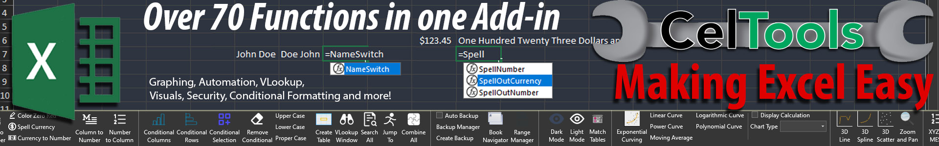
=COUNTIF(A2:A10, "John")The Power of CelTools for Excel Dashboards
While you can do this manually using the steps outlined above, CelTools automates much of this process. CelTools offers 70+ extra Excel features for auditing, formulas, and automation that make creating dynamic dashboards a breeze.
A Technical Summary: Combining Manual Techniques with Specialized Tools
The combination of manual techniques like PivotTables and specialized tools such as CelTools provides the most robust solution for creating dynamic Excel dashboards. By understanding both approaches, you can choose the best method based on your specific needs.


